All Posts By

Karolina

friends

photoshoot with jetkat photo

September 23, 2013

A few weeks ago, the lovely and talented Kate Skogen of JetKat Photo came over to our place for an afternoon photoshoot.

This has been on my list for a while:  a photo session just for my husband David and myself.  Kind of odd for us, given that our engagement photos were selfies we took with a point-and-shoot film camera and we weren’t exactly at ease during our (somewhat formal) wedding photos.

Kate and I met through Instagram, where we discovered that we are neighbours in the same Eichler ‘hood.  Upon meeting in real life (before which I did some research, stalked her blog, and found her awesome work, natch) I decided to go for it and enlist her services.  Kate suggested we shoot at our home, which I loved because it helped us to feel a bit more comfortable and included what has become a big part of our life lately:  this house.

We had a nice afternoon hanging out, drinking tea, and chatting about home renovation projects (what else?)  Kate snapped pictures of us and our surroundings.

Winston made sure to be in most of the shots.  We were impressed by his ability to pose himself expertly in every setting.  Indulge me for a second, if you will:

Yep, that’s my dog.  Posing on a sheepskin in the guest room.  I think he really liked Kate.

I’ll leave you with my favourite shot, taken in our atrium:

Huge thanks to Kate for her fantastic work!  Make sure to check out her website and blog over at JetKat Photo.

All photos by the amazing Kate Skogen

interiors

quiet design

September 8, 2013

As much as I love colour, as summer comes to a close, I am finding myself drawn to quiet, clean design lately.  This may be compounded by the fact that I just burned through a certain BBC television series which ended on a very sad note.  Suddenly I’m craving foggy mornings.  And tea on foggy mornings.  Tea on a foggy morning whilst wearing a slouchy grey wool sweater is kind of a dream of mine right now.

I find gloomy weather to be more relaxing than the every day get-out-of-bed-and-go-go-go! sunshine, which we’ve been enjoying just about every day since last January.  I like my melancholy and quiet, even if it may not seem like it by the large number of exclamation marks I use at times.


I’d love to go in this direction style-wise for our house at some point, but there’s something about the fact that we are here in happy and bright California which prevents me.  Maybe one day when we relocate to a northern climate.  Or perhaps I’m just itching for a trip to someplace with real weather, rather than endless (unmercifully) clear blue skies.

Have a good weekend everyone.  It’s going to be a hot one here, so I’ll be going to these spaces in my mind.  Maybe curling up with a book and thinking of rainy winter days.

Photo sources:
1 | 2 | 3 | 4 | 5 | 6

geeking out love

love: the ikea app

September 4, 2013

In my day job, I tend to keep an eye on certain tech blogs, which recently featured IKEA’s new app.  As is not uncommon, I too have a kind of love-hate relationship with IKEA, but this app really intrigued me.

The best part of of this app:  augmented reality on your mobile device to help you figure out how pieces of furniture will look in your space, BEFORE you go to the store and then spend all evening assembling your new acquisition.  Yes!  BEFORE you’re knee-deep in flat-board packaging, wordless yet cutely illustrated instruction pamphlets, and tiny wood dowels, you can see the furniture in your house!  Like MAGIC.  The promise of this warmed my heart, so I thought I’d take the app for a test drive.

This resulted in the long, geeky post ahead.  Consider yourselves warned.

First, IKEA’s video with a demo of the app:

The idea is quite genius, I have to say:  you place the IKEA [2014] catalog on the ground where you want to visualize a piece of furniture and point your tablet or smartphone at it.  The item is then rendered on your device, with the correct 3D projection and scale.  You can literally walk around the virtual furniture piece of your choosing and check out how it would look in your room. 
How?  Math and computer science, friends.  The realm of my day job.  If you think placing the catalog on the ground is lame, it (plus some object recognition software) is actually the secret sauce here.  Here’s why:
  • It’s a textured object (i.e., it has text and pictures on the cover) and the cover does not change much in appearance, so it’s easy to detect in the image using object recognition techniques.
  • It’s flat and when on the ground, makes it easy to deduce what its orientation in 3D space is relative to the camera on your mobile device.
  • It comes in a standard size, so it’s easy for the software to scale the rendering of the furniture using the size of the catalog as a reference.
So, so smart.  Kudos to IKEA for creating with this.  [Edit:  the developer is actually Metaio, thanks Lin!]

If you’d like to give it a try, you’ll have to have some version of the 2014 IKEA catalog handy.  I tried out the app with the electronic version of the catalog on my laptop and a teeny printout of the catalog front page as my marker, since I don’t have the real thing.

It worked quite nicely, although I was at first annoyed that I couldn’t get to this directly from the app.  But then I wouldn’t be looking through the catalog, which is what IKEA wants me to do.  Sneaky IKEA.  So, for you, my friends, here’s my cheat sheet for getting to the magic bits as quickly as possible.

To get to the 3D product renderings, here’s what I did:

  1. Paged through the electronic catalog on my laptop until I reached the furniture product pages.
  2. Found a page with the red plus symbol used to indicate bonus content is available
  3. I pointed my phone at my laptop screen and waited for the camera to focus and the app to recognize the page

In the app, an image would then pop up indicating that 3D rendering was available.  Here’s a screen shot of what that looks like:

You then tap on the icon and follow the tutorial, which includes a catalog and non-catalog method for rendering furniture in your room.  I opted to use a tiny printout of the IKEA catalog front page with the catalog method:

Once the app detects the catalog, you can select furniture and have it render.  Since my printout was small, so was the furniture (which was kind of adorable).  Winston appears for scale!

And with the classic POÄNG chair, for completeness:

It was a lot of fun visualizing tiny furniture.  I could walk all the way around it and see it from various angles.  My lighting wasn’t the best so at times the app would lose track of where the catalog was, the chair would disappear and have to be rendered again.

I also tried the non-catalog mode and, after some adjusting of the object size and location on the screen, was able to get pretty good results as well.  So, you can play around even if you just have the electronic catalog and a phone, no printout or physical catalog required.

Aside from the 3D rendering, IKEA has packed a tonne of bonus content into their app for the first part of the catalog, which features styled rooms, using the same method (look for the red plus again).  It’s mostly cutesy movies of children and families romping through playful sets, but I found one that blew my mind (a little).  (OK, maybe a lot.)

This one:

Once you click (or tap) through, you find yourself peering through the looking glass at another room:  a kitchen.

Moving your phone to your left, right, up and down reveals parts of this virtual room you’ve been given a peek into.  Here are a few screen shots I took as I panned my phone around in different directions, looking up at the ceiling, down at the floor, to my right and left:

These screen shots quite don’t do it justice, I realize, but I could look at this room from (almost) every possible angle through my phone.  After a while, I was expecting to see my own feet on that wood plank floor when pointing the phone down.

Other bonus features which I appreciated were detail shots of their styling:

I do love the Scandinavian look.  Those chairs, by the way, um… wow.

I think this app may have succeeded in possibly luring me in for a shopping day.  (Or I maybe I’ll just stay home and keep looking at that one kitchen over and over and over?  Possible.)

Back to the 3D rendering, I would love to have an app like this for other furniture.  Which brings me to another app which addresses this exactly:  Furnish.

Furnish provides a similar experience to the IKEA app, but for a variety of retailers.  I tried it out and it’s decent, but without the catalog trick, the rendering is not as accurate as IKEA’s app because it’s up to the user to get things right.  I found that manipulating the 3D rendering was pretty finicky (just like IKEA’s non-catalog mode).

You can check out Furnish in your app store for more details.  I tried it with a few modern pieces, and thought I’d share the results:

Not bad.  The app was pretty good at detecting the orientation it should render the chair in (better than the IKEA app in my opinion), but the scaling was off and required that I do my best to guess what the size should be.  That would be my biggest complaint.  When trying out new furniture, I really want to see how much space it takes up in my room.

Overall I really enjoyed playing with both of these apps, though we still have a long way to go.  I would love to have things render in the correct scale without the catalog trick and to be able to render multiple pieces in one view.  A mashup with Google Glass would be amazing.  And I would be delighted if my other favourite retailers (DWR, West Elm, CB2, Serena & Lily) offered similar apps.

What do you think?  Have you given either of these a go?

(Nope.  Not a sponsored post.  Just some fun geeky times.)

furniture love

love: telephone chairs

August 30, 2013

Hi there, friends.  I realize it’s been a bit quiet around here since my living wall update and there’s a good reason for that, trust me.  I can’t really disclose too much except to say this side-project has me doing a LOT of research.  The best kind:  furniture research.  Squeee!

And it has somehow lead me to a piece that I bet a few of you know well and which I recall from my great-aunt’s house:  the telephone chair.

Edit:  For those of you who are much too young to remember (you know who you are), a telephone chair is a little bench/chair with an elevated part upon which you set your rotary dial phone and in which you probably kept your address book.

In particular, I’m looking at telephone chairs with some midcentury sass and finding some amazingness:

 Photo sources (clockwise from top left):  pinterest | precious.no | ARC | pinterest

Ugh.  Crazy, right?  Right.

I know what I’m going to keep my eyes peeled for at the next antiques mall or flea.  Thrifting this weekend, anyone?

diy landscaping projects weekend

weekend project: living wall

August 22, 2013

Hi friends!  Finally the reveal you’ve been waiting for:  our living wall!  I’m so happy that it’s done, looking so lush with lots of pretty plants, and, did I mention that it’s done?  Yeah!

What do you think?  I think I am in love with it.

Let me back up a bit to give you the details of how we built this, in case you’re interested in constructing your own.  To start, I wanted to create a wall that would not damage our rather precious and not terribly robust Eichler siding.  This meant not having plants, soil, and moisture right up against the siding.

After some research, I chose to go with the Woolly Pockets since they have an impermeable membrane built into the pocket so moisture is contained.  The pockets are designed to mount directly to a wall, using wall anchors or screws.  However, I didn’t want to put a million holes in our siding and have the weight of the pockets supported by the siding and wall anchors only.  I needed something more sturdy that mounted to the wall studs.  My solution was to design a backing board that would mount to the studs, onto which we would then attach rows of Wally Threes.

Here’s how it came together:

TADA!  When I think back, it was almost that simple.  Before things got serious, I used painter’s tape to convince myself of where exactly I wanted the wall to go:

Basic materials included plywood (we used 5-ply, 3/4″ thick), 2×4 redwood lumber (nice dry stuff), and a whole lotta wood screws.  The wall was to be 68″ wide by 78″ tall, to accommodate six Wally Three pockets.

Given the size of plywood at the store, this meant we had two half-panels which we assembled to make the full backing board.  The back was framed using the 2x4s, to give ample space between our siding and the board, and to accommodate a French cleat which was instrumental in getting the board up and attached to the wall studs.

That cleat was magical, I tell you.  And I may be in love with my table saw (Ryobi BT3000, which I bought second-hand!) as a result. The alternative to using the cleat would have been for one person (myself or my husband) to be holding up a giant piece of plywood whilst the other scrambled to drive screws through to hang it.  Painful and totally not fun, I’m sure.

With the cleat, we just attached half of the cleat (pointy edge up) to the wall, driving 3″ screws through into our studs.  We cut the other half of the cleat (pointy edge down) in half, and the two halves went along the tops of the plywood panels.  Lift, hang, and behold!

To make things extra-secure, we did attach a 2×4 in the middle of the space behind the wall, and drove 2″ screws through the plywood along the cleat and the 2×4.  That thing is not going anywhere.

After mounting the backing board, attaching pockets, and running irrigation, we planted.  And planted and planted and planted.  I believe I visited no fewer than four nurseries in the past week, because I really wanted a wall that I loved.  And when I said that I wanted ALL of the plants, I was not joking!

And so, I ended up using the following to fill the wall, mostly from Flora Grubb and my local Summerwinds:

  • Bromeliads (Vriesea Gigantea Nova and Tessellata)
  • Ferns (foxtail and Sprengeri)
  • Stonecrop (‘Bronze Carpet’)
  • Foxtail agave (Agave attentuata)
  • Euphorbia (‘Dean’s Hybrid’)
  • Echeveria (Hens and chicks)
  • Senecio mandratiscae
  • Japanese forest grass (Hakonechloa M. ‘All Gold’)
  • Yucca rostrata
  • Tiny mistletoe cactus (Rhipsalis ewaldiana)
I realize these will not all co-exist happily until the end of time, and the wall will evolve.  We’ll see if the bromeliads are OK with this location or not, as I’ve never dealt with them before.  It turns out that to water them you need to fill up their cups, so we may rig a tiny sprinkler above them in addition to the drip irrigation.  And anything that’s not completely happy can be relocated to other parts of our yard.

Now, I just need some sort of seating from which I can enjoy the wall.  Hanging chair or Acapulco?

(This is not in any way a sponsored post.  And you can find my earlier post about planning this project right here.)

All photos by Karolina Buchner

Uncategorized

hello and happy friday

August 16, 2013

Hello friends!  Just checking in to say hi, I’m alive.  This week has been a full one and the weekend promises to be the same:  I have two events (one of which I’m hosting) on Saturday evening then a photo shoot with my new favourite photographer friend, Kate of JetKat Photo.  The weekend is going to be action-packed!

But, the good news is that the living wall is fully planted with lots of exciting plants.  It may have involved me planting things by night after work, but I am very pleased with the result.  And I am fascinated by the giant bromeliads I got.  Aren’t they pretty?

So, stay tuned – lots of goodies are coming your way next week.

Happy Friday and happy weekend!

eichler friends

eichler mini-tour: karen’s new home in walnut creek

August 7, 2013

One thing I’m discovering about Eichler home owners is that they are fierce weekend warrior types, with an incredible dedication to the original details of their houses.  Karen of Destination Eichler is one such person, who I had the pleasure of finally meeting this weekend!

Karen is a woman of many talents:  a ballet dancer, professional photographer, and product manager at YLighting.  To complement all of this, she recently became the proud owner of a Jones & Emmons designed Eichler home in Walnut Creek.  We met through a mutual friend and this blog, first over email, and I was very honoured to receive an invite to Karen’s housewarming party.  Karen has been blogging about the restoration of her home, located in the Rancho San Miguel tract made famous by this super-glam Eichler sales brochure.

That’s Karen, on the right, entertaining guests.

Karen’s house is a very similar model to our own, but has suffered from the dreaded Fairly Recent Renovations.  I have to say I admire Karen and John’s fearlessness in taking on an Eichler sheathed so completely in vinyl siding (not pictured, out of respect for their house!) and sincerely hope they are rewarded with pristine original wood siding underneath.  I am keeping my fingers crossed SO HARD for you guys!

Siding aside, Karen has already done an amazing job improving the interior of the house by painting and replacing light fixtures with some sleek mid-century styles, including a gorgeous Nelson saucer lamp in the dining room.  And I really like the all-white interior which you can see above.

And after only a month of living here, you can see plenty of great vintage finds in their home.  High fives on the vintage Acapulco and Bertoia seating.  I know that with Karen’s eye, this house is going to rock.

Besides the vintage furniture and the huge backyard, I am also quite envious of the gallery-style atrium wall, behind the Bertoia chairs here.  It would look really neat with non-textured glass, as I’ve seen in some remodels.  Because, as you know, you can never have too much single-pane glass in an Eichler!

After the party, we checked out the neighbourhood, as any self-respecting Eichler home owner does.  Every Eichler subdivision is a bit different in character and we enjoyed seeing the models here – actually a pretty big departure from the ones we’re used to seeing around Fairglen in San Jose.  Similar to our tract, there are about 350 Eichlers here with flat-top and peaked roof models, with a number of more exotic models as well.

This green one really confused us:  there is no front door!  The main entrance to the house is on the side somewhere.  I’d love to dig up the floorplan for one of these, or keep an eye out for open houses.

Construction on Rancho San Miguel started in 1955 and completed in 1959, with the homes near Ygnacio Valley Road being the first constructed.  The neighbourhood is shared by both Eichler and Jordan & Reed homes, which lead me to wonder if these are indeed Eichlers or not.  We even spotted a few with cinder block front walls and roofs shaped almost exactly like the Alexander homes of Palm Springs.  The variation in styles is most likely explained by the staged construction over these years, during which Eichler worked with different architectural firms (Ashen & Allen, Jones & Emmons, and Claude Oakland), based on a bit of neighbourhood history.  Since we found these models nearest Ygnacio Valley Road, I’m guessing they might be some of the earlier ones.

Huge congratulations to Karen and John on their new home!  Keep up the good work!

If you want to learn more about Eichler neighbourhoods, you can find a bunch on the venerable Eichler Network.

Acapulco chair photo by Karen Nepacena
All other photos by Karolina Buchner

deciding landscaping projects

deciding: living wall plants

July 31, 2013

For those who are so closely following my living wall project, get excited!  It’s time …. ALMOST.

This past weekend we built the plywood framed backing for the living wall and we’re in the home stretch of this project!  I just have to mount the backing in our atrium, attach the Woolly Pocket Wally Three pockets I got last week, and we’ll be ready to plant.  It’s time for me to make a plan for this major plant purchase (hooray!), but first, I need to decide on the look for my living wall.

I’ve been researching what kinds of plants will do best where the wall is installed.  The wall gets about 4-6 hours of direct sunlight in the mornings and it does get quite warm due to heat being radiated by the concrete floor of our atrium.  We’re running drip irrigation to all of the pockets, so watering should be easy to adjust.

So:  options!  There are many, but here are three that appeal to my taste . . .

1.  A bit of Hawaii:  bromeliads and ferns

Your own little tropical jungle, on a wall.  The punch of colour from the bromeliad blooms is a nice way to add some interest and break up the greenery.  I’m quite drawn to this, but not sure if these shade-loving plants be happy given how much light this spot gets.  Then again, our long-gone bougainvillea was in this spot and never bloomed, leading me to think it’s not too much sun after all.

2.  A bit of Palm Springs:  succulents and agaves

I love succulents, don’t you?  Trailing succulents might be perfect for the wall.  Agaves, on the other hand, might be a bit on the heavy side for a wall installation.  (Have you ever tried moving an agave?  They are dense, water-hogging prickly monsters, trust me.)  Still, here they are, tempting me to try them out as part of my wall.  The installation pictured here, and at the top of this post, is from Smog Shoppe, a really cool event space in LA, with a HUGE number of plants (just shy of 2000 plants, I kid you not!) in Woolly Pockets.  Bonus:  you can check out the full list of the plants used in the case study for this project.

3.  A bit of everything:  staghorns, grasses, and heuchera

This is reminiscent of the walls I saw in person at Flora Grubb.  There are even some lime-green bromeliads in here!  This wall, designed by Daniel Nolan of Flora Grubb, is what started it all for me.  It’s a great mix of textures and colours.  I especially like the silvery look of the staghorns as compared to the other foliage.  And I might add some foxtail ferns in for even more crazy texture.

What do you all think?  Any green thumbs out there with recommendations on what to plant?

All images via Woolly Pocket and Flora Grubb Gardens.

diy projects weekend

weekend project: beam repair part 2 (we did it!)

July 23, 2013

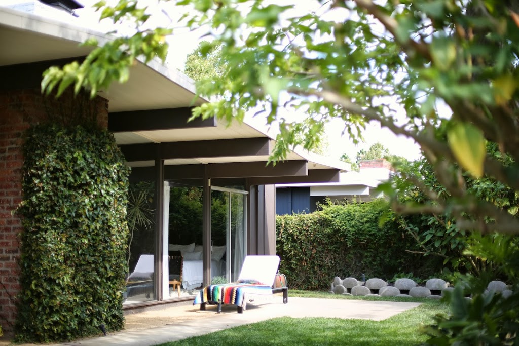
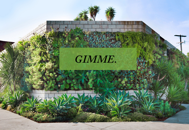
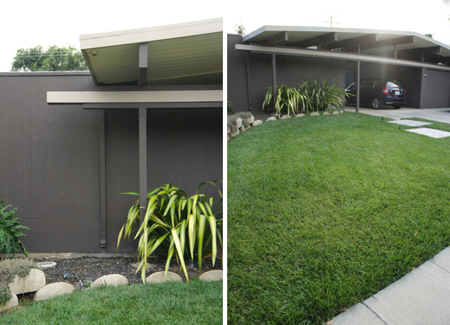
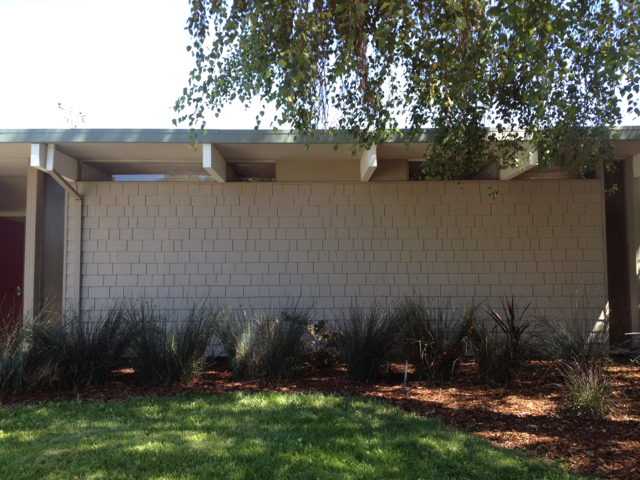
As I write this, Winston is laying beside me, (I think) exhausted from the weekend’s work.  He worked very hard supervising everything, as pictured here in our front yard.  We’ve been busy!

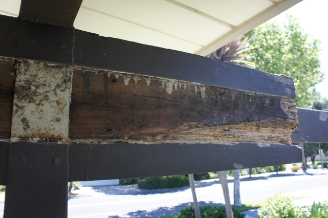
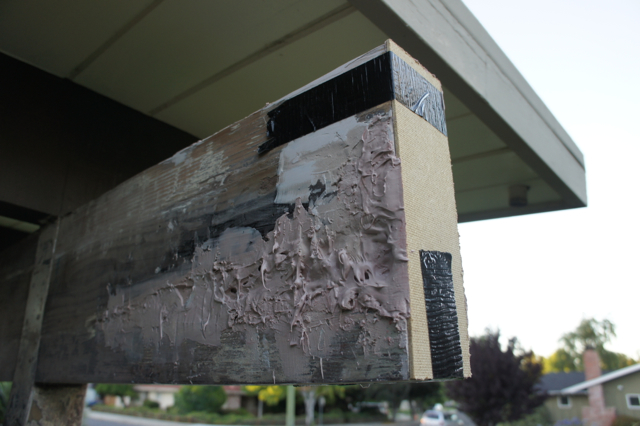
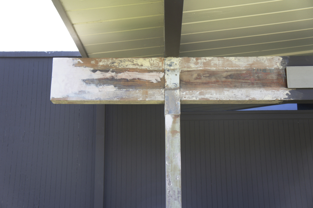
If you recall about a month ago, I posted about the horror of dry rot which we discovered had destroyed part of a beam on the front of our house.  As a refresher, here’s what it looked like:

It still gives me the heebie geebies.

I’m happy to report that this weekend, we finally restored everything back to its original state.  Hopefully, much better than its original state.

Let me walk you through the rest of the process here, which took us actually three weekends to complete.  It’s a long one, so grab yourself a seat.  And maybe a drink.  An iced tea would be appropriate.

Weekend 1:  Epoxy, sand, more epoxy!

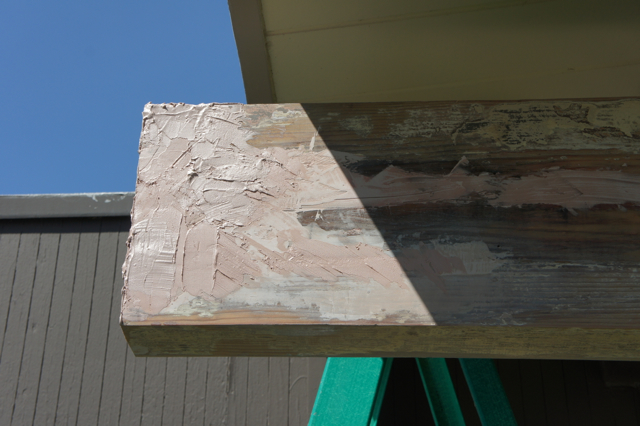
As I mentioned in my earlier post, the product we used to fill in the rotten areas was a 2-part epoxy filler.  There are various products available, the most common being Bondo, which we used.  You can find this at big-box home improvement stores and auto repair shops.  Guess where it retails for less.

It’s pretty weird stuff to work with.  You have to work in batches by mixing a small amount of hardener (which comes as part of the kit) with the epoxy material, and then apply it before it sets up.  We found it lasted almost exactly 3 minutes before turning to rubber and becoming unusable.  Also:  it smells pretty toxic.  We wore gloves when working with it and were outdoors in the fresh air.

We worked building it up layer by layer:

It was necessary to sand down the bumps every layer or so, in order to more easily apply the next layer and to make sure there were no air bubbles or crannies left.   We taped a piece of hardboard to the end of the beam to help us form better edges.

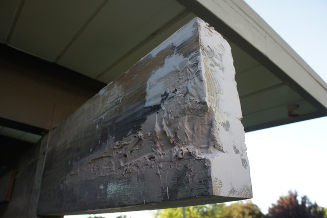
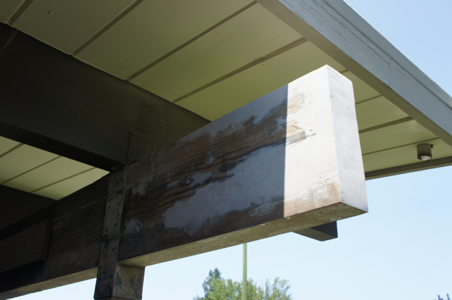
Finally, after using about a container and a half of epoxy, we applied the last layer.  I tried my best cake-icing technique here:

Then, we took a sander to it, and BAM.  It looks like a beam again!

The Bondo was really quite easy to work with once we got the hang of it, and it sanded to nice, sharp edges.  One strange thing is that it has a sticky skin even after it’s fully dry, which freaked us out initially, thinking it hadn’t cured.  But, after sanding, it was fine.  I would definitely use it again for jobs like this one.

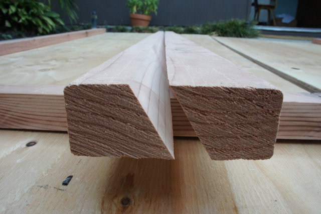
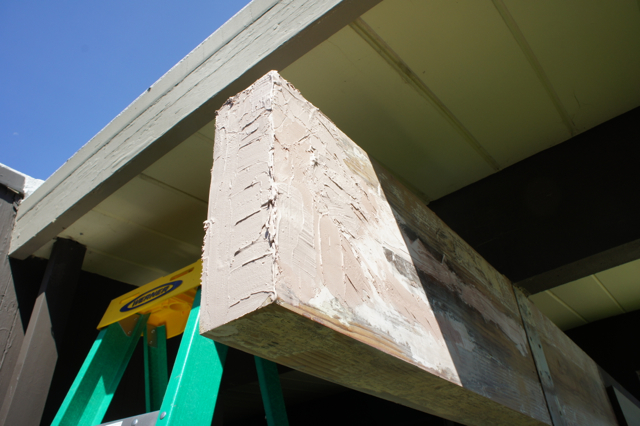
Weekend 2:  Cut new trim, nail it up, and fret about things not being square!

We considered re-using the original trim (made of redwood!) but sadly it was in rough shape and rotting in a few places too.  So, we ended up purchasing new trim at the hardware store.  We took exact measurements of the old trim and cut new pieces.  This involved chiseling out part of the back of each trim piece to accommodate the metal brace you can see on the pillar above.  Here’s to developing new wood-working skills!

We felt pretty good about making the new trim until we put it up and realized we couldn’t make the end piece line up with the trim.  AT ALL.  It turns out that nailing trim up is the most inexact method of attaching it to your house and we puzzled over this for a long time.  Also, I imagine our beam and trim weren’t perfectly straight either.  Sadly, I don’t have pictures, we were that absorbed by this conundrum.

It wasn’t until after our vacation that we solved it.

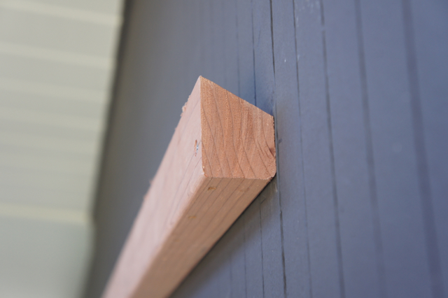
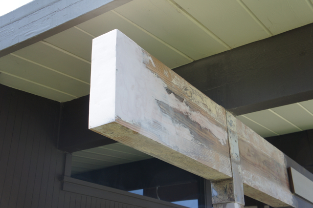
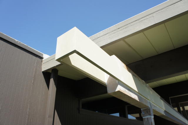
Weekend 3:  Pull trim off, re-attach, seal, prime and paint!

There was a lot of brainstorming this weekend.  On Saturday, we actually (carefully) ripped off the trim on the back of the beam.  Then we nailed the end cap to the front trim, by first partially driving nails through it, then having multiple hands hold it while hammering.

Once that was in place, we attached the back trim with a screw.  Lined it up with the end cap, and fixed it in place with a second screw.  We then nailed it and the end cap in place completely and removed the screws, applied wood putty over all the nail holes and called it a day!

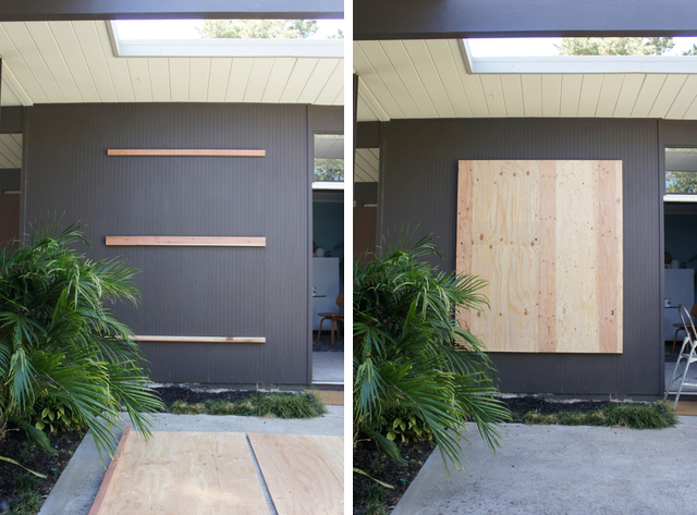
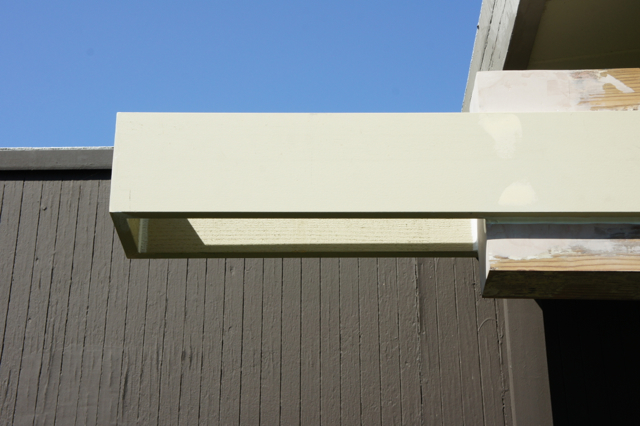
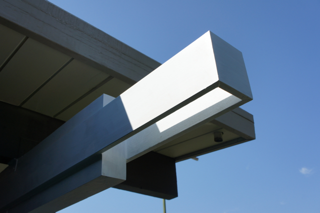
On Sunday morning, we caulked all around where the beam and the trim met.  I sanded down the wood putty and then primed the whole thing:

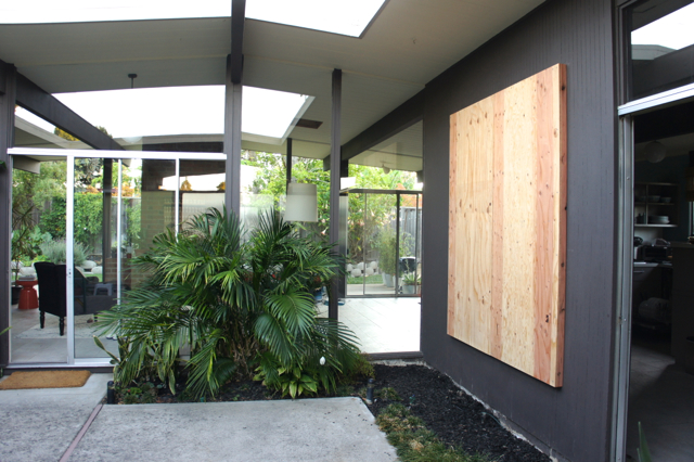
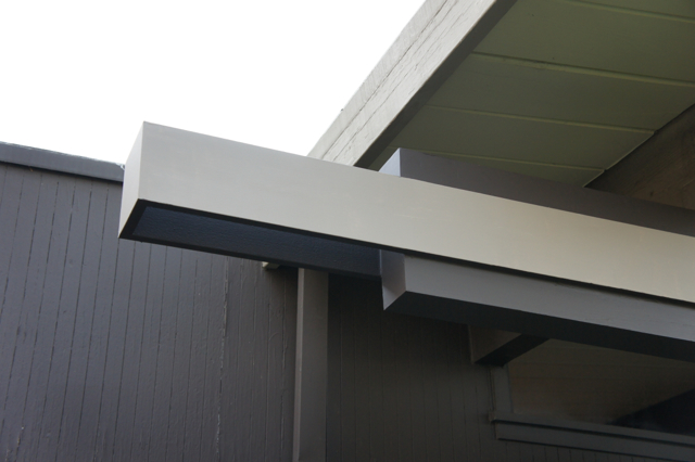
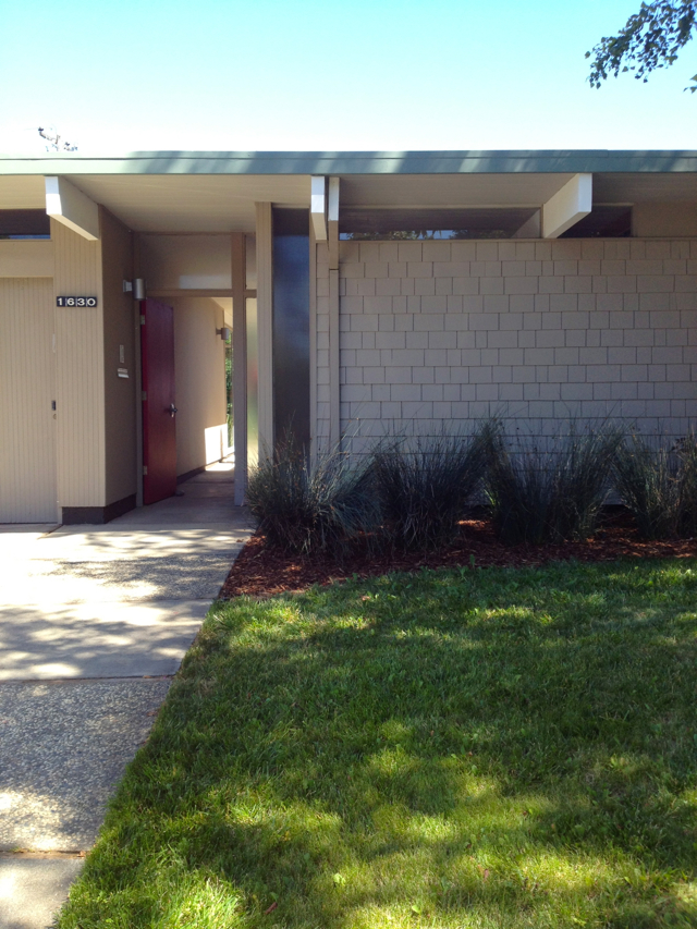
Then painted.  This was the most exciting part:  our house was BACK!

Yeah!

Everything is back in place and looking great.  Though I think it just inspired us to pick at all the other beams, patch them with epoxy, and replace the siding.  Wouldn’t it be great if everything were as crisp and freshly-painted as this beam and trim?

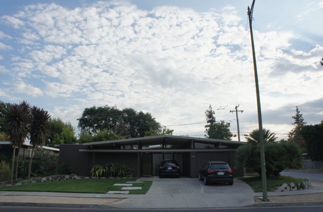
But just for now, perhaps it’s time to pause and enjoy some fluffy, happy clouds and pat ourselves on the back.

I need to catch my breath a little, before the next project.

To see where we started, check out my post:  beam repair, part 1.

eichler

eichler mini-tour: 1630 fairorchard

July 19, 2013

It’s no secret in our neighbourhood that when there’s an open house, ALL of us nosy neighbours pile in to look around.  Come on!  It’s fun to see what people have done with their houses, how well preserved the Eichler features are, and to get ideas about furnishings based on the staging (well … sometimes).  We are quite shameless around here.  I’ll share a few sneak peeks so you join in the voyeuristic fun too.

Come and snoop with me!

A few weekends ago, we stopped in at 1630 Fairorchard Ave in our own Eichler subdivision.  The house has since sold, but you can still look up the listing on Zillow, which includes plenty of spooky-looking HDR shots of the interior.  Because I don’t enjoy overdone HDR interior shots, I’ll treat you to my minimally processed iPhone pictures.  And so, back to the house.

Despite the odd wood-shingled (?) front, this place is a very pleasant surprise inside.

It’s a flat-top atrium model, with clerestory windows in the main living space.  The atrium is in great shape.  Mahogany paneling is everywhere.  As are the original globe lights.

And the ceilings.  Oh, the ceilings!  The stuff of dreams.  I’m not sure if they were restored, but they certainly look pristine and very original.  The light grey pickling stain was an original treatment applied by the builder.

At our house, we have all of the ceiling boards painted, except in the garage.  I’ve also found the original ceiling inside some of our hall closets – with the same stain as well.

One of things I love about the flat-top models are these cool vertical windows at the front.  They emphasize the geometry of these houses in addition to providing more light.

Speaking of geometry, it’s views like these that we Eichler-people live for:

Everything lines up.  So perfectly.

 
One detail I noted were the closet doors, which have been dressed up with a textured cloth.  A little too contrast-y for my taste but still neat to see.  Eichler closet doors were originally covered in grasscloth to evoke Shoji screens.  This is something I’m meaning to try in our hobby room, to help the door blend in with the mahogany walls.

And, a final cute detail:  the original intercom!

Classic, indeed.

Kudos to the folks who lived here for preserving so many original features.  And here’s hoping the new owners keep it up!

All photos by Karolina Buchner