Browsing Category

geeking out

geeking out

geeking out: paper replicas of warsaw buildings

April 18, 2014

While catching up on one of my favourite design blogs, Freshome, I spotted these amazing little paper replicas of buildings from my birthplace of Warsaw, Poland.  They are created by graphic design firm Zupagrafika.  A bit of a departure from what I post here normally, but these feel very personal and their design is spot-on.

Check them out:

The details are perfect:  the tiny satellite dishes attached to the building exteriors and the graffiti on top of smog-darkened concrete.

For me, they evoke many not-so-distant memories of walking through these often not-so-pretty parts of Warsaw.  This city has seen a lot.  For those not familiar:  in World War II, Warsaw, including its very charming Old Town, was completely reduced to rubble.  The Old Town was rebuilt and new housing developments sprung up in the 1950s and 1960s.  One of those is ‘Za Żelazną Bramą’, which translates to ‘Behind the Iron Gate’.  Its style is influenced by Le Corbusier’s brand of brutalist modernism.  Which means LOTS of concrete.

Indeed many Varsovians consider these buildings to be a blight.  They may not be pretty, but they have their own stories to tell.  The PKO Rotunda building was the site of a natural gas explosion in the 1970s which is remembered by many in the city.  Kieślowski’s ‘Dekalog’ was set in and revolves around the lives of an array of characters residing in one of the housing complexes.  Now I’m feeling nostalgic.  Strange yet familiar times.  I love that Zupagraphika has decided to take these iconic buildings and honour them in some way.

You can purchase these paper cutouts through Zupagrafika.  And (bonus!) I’ll soon be in Poland hunting for these in Warsaw:  cutouts and buildings alike.

(This is in no way a sponsored post.)

Images via Freshome and Zupagrafika

furniture geeking out

geeking out: float table from rock paper robot

October 8, 2013

Oh my heavens.  This is quite possibly the most beautifully geeky piece of furniture I have ever seen.

The RPR Float Table is by Rock Paper Robot, a company founded by Jessica Banks, a roboticist and product designer with a MSc in Computer Science (MIT AI Lab!), and Mihae Mukaida, a Parsons design school alumna.  My kind of people.

The table is composed of wooden cubes held together by thin wires, with an arrangement of magnets embedded in them, causing the cubes to repel each other.  The execution of this as a piece of furniture is gorgeous.  Seeing the table react to being pushed and touched is almost … unnerving.

Please enjoy:
 

RPR Float Table from RockPaperRobot on Vimeo.

It’s beautiful (look at that wood grain!) and so bizarre (it looks like it’s being tickled in the video).  And you know how much I like to anthropomorphize furniture.  Yes.

Happy Monday!

Photos all from RockPaperRobot and Journal Du Design.

geeking out love

love: the ikea app

September 4, 2013

In my day job, I tend to keep an eye on certain tech blogs, which recently featured IKEA’s new app.  As is not uncommon, I too have a kind of love-hate relationship with IKEA, but this app really intrigued me.

The best part of of this app:  augmented reality on your mobile device to help you figure out how pieces of furniture will look in your space, BEFORE you go to the store and then spend all evening assembling your new acquisition.  Yes!  BEFORE you’re knee-deep in flat-board packaging, wordless yet cutely illustrated instruction pamphlets, and tiny wood dowels, you can see the furniture in your house!  Like MAGIC.  The promise of this warmed my heart, so I thought I’d take the app for a test drive.

This resulted in the long, geeky post ahead.  Consider yourselves warned.

First, IKEA’s video with a demo of the app:

The idea is quite genius, I have to say:  you place the IKEA [2014] catalog on the ground where you want to visualize a piece of furniture and point your tablet or smartphone at it.  The item is then rendered on your device, with the correct 3D projection and scale.  You can literally walk around the virtual furniture piece of your choosing and check out how it would look in your room. 
How?  Math and computer science, friends.  The realm of my day job.  If you think placing the catalog on the ground is lame, it (plus some object recognition software) is actually the secret sauce here.  Here’s why:
  • It’s a textured object (i.e., it has text and pictures on the cover) and the cover does not change much in appearance, so it’s easy to detect in the image using object recognition techniques.
  • It’s flat and when on the ground, makes it easy to deduce what its orientation in 3D space is relative to the camera on your mobile device.
  • It comes in a standard size, so it’s easy for the software to scale the rendering of the furniture using the size of the catalog as a reference.
So, so smart.  Kudos to IKEA for creating with this.  [Edit:  the developer is actually Metaio, thanks Lin!]

If you’d like to give it a try, you’ll have to have some version of the 2014 IKEA catalog handy.  I tried out the app with the electronic version of the catalog on my laptop and a teeny printout of the catalog front page as my marker, since I don’t have the real thing.

It worked quite nicely, although I was at first annoyed that I couldn’t get to this directly from the app.  But then I wouldn’t be looking through the catalog, which is what IKEA wants me to do.  Sneaky IKEA.  So, for you, my friends, here’s my cheat sheet for getting to the magic bits as quickly as possible.

To get to the 3D product renderings, here’s what I did:

  1. Paged through the electronic catalog on my laptop until I reached the furniture product pages.
  2. Found a page with the red plus symbol used to indicate bonus content is available
  3. I pointed my phone at my laptop screen and waited for the camera to focus and the app to recognize the page

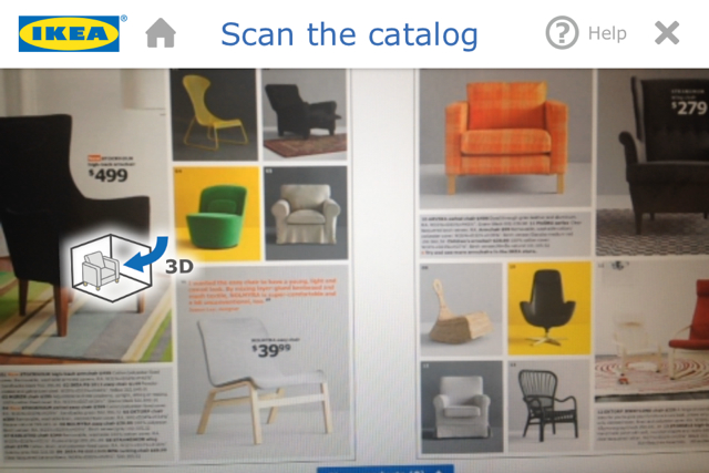
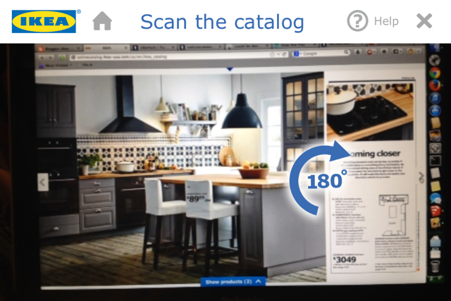
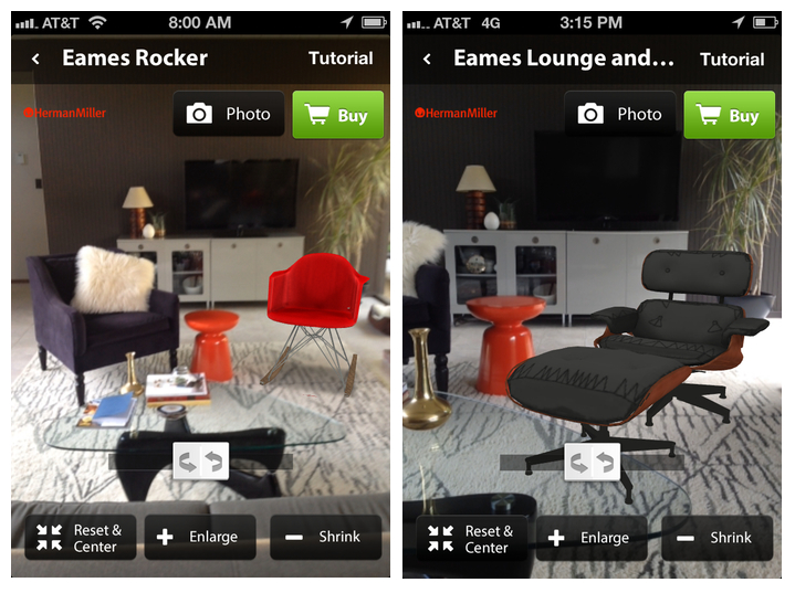
In the app, an image would then pop up indicating that 3D rendering was available.  Here’s a screen shot of what that looks like:

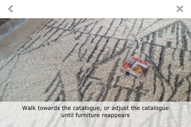
You then tap on the icon and follow the tutorial, which includes a catalog and non-catalog method for rendering furniture in your room.  I opted to use a tiny printout of the IKEA catalog front page with the catalog method:

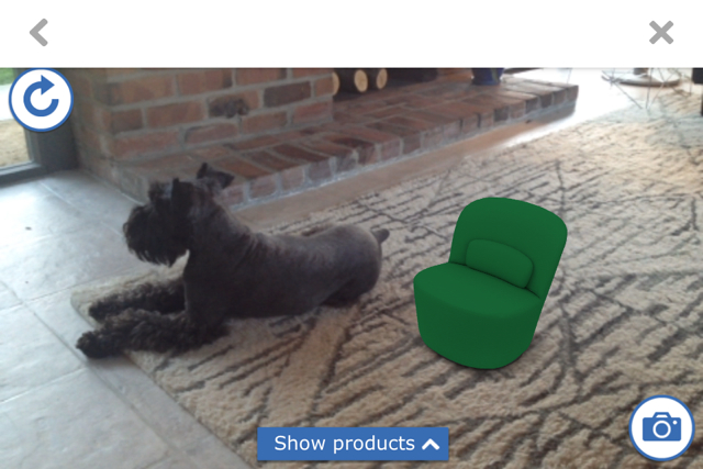
Once the app detects the catalog, you can select furniture and have it render.  Since my printout was small, so was the furniture (which was kind of adorable).  Winston appears for scale!

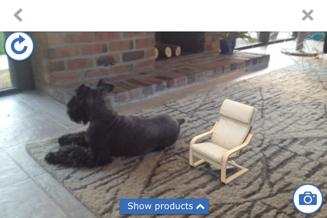
And with the classic POÄNG chair, for completeness:

It was a lot of fun visualizing tiny furniture.  I could walk all the way around it and see it from various angles.  My lighting wasn’t the best so at times the app would lose track of where the catalog was, the chair would disappear and have to be rendered again.

I also tried the non-catalog mode and, after some adjusting of the object size and location on the screen, was able to get pretty good results as well.  So, you can play around even if you just have the electronic catalog and a phone, no printout or physical catalog required.

Aside from the 3D rendering, IKEA has packed a tonne of bonus content into their app for the first part of the catalog, which features styled rooms, using the same method (look for the red plus again).  It’s mostly cutesy movies of children and families romping through playful sets, but I found one that blew my mind (a little).  (OK, maybe a lot.)

This one:

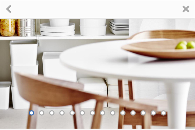
Once you click (or tap) through, you find yourself peering through the looking glass at another room:  a kitchen.

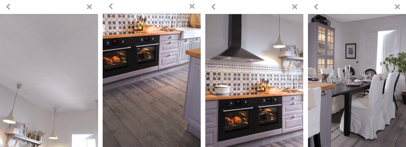
Moving your phone to your left, right, up and down reveals parts of this virtual room you’ve been given a peek into.  Here are a few screen shots I took as I panned my phone around in different directions, looking up at the ceiling, down at the floor, to my right and left:

These screen shots quite don’t do it justice, I realize, but I could look at this room from (almost) every possible angle through my phone.  After a while, I was expecting to see my own feet on that wood plank floor when pointing the phone down.

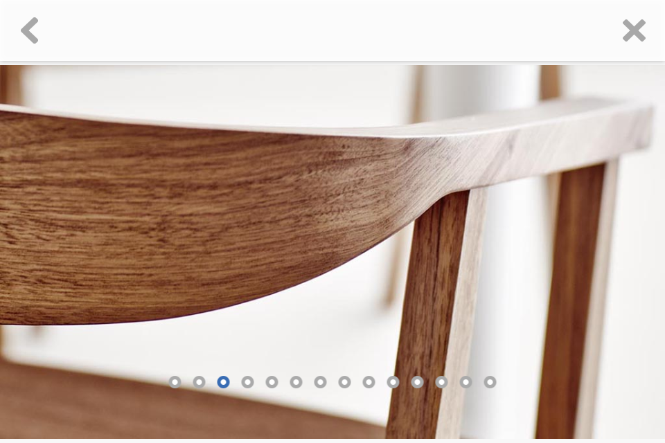
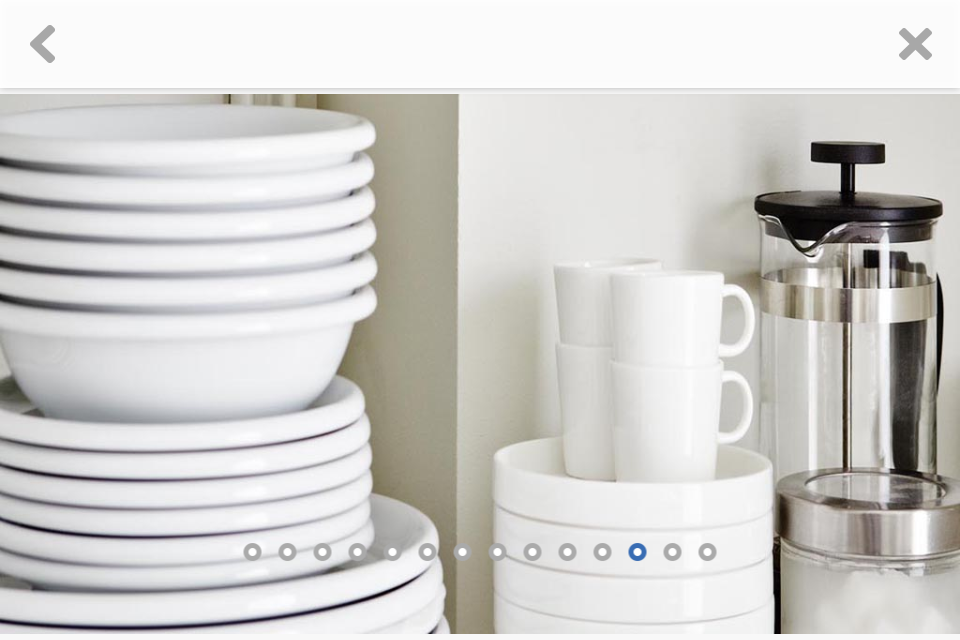
Other bonus features which I appreciated were detail shots of their styling:

I do love the Scandinavian look.  Those chairs, by the way, um… wow.

I think this app may have succeeded in possibly luring me in for a shopping day.  (Or I maybe I’ll just stay home and keep looking at that one kitchen over and over and over?  Possible.)

Back to the 3D rendering, I would love to have an app like this for other furniture.  Which brings me to another app which addresses this exactly:  Furnish.

Furnish provides a similar experience to the IKEA app, but for a variety of retailers.  I tried it out and it’s decent, but without the catalog trick, the rendering is not as accurate as IKEA’s app because it’s up to the user to get things right.  I found that manipulating the 3D rendering was pretty finicky (just like IKEA’s non-catalog mode).

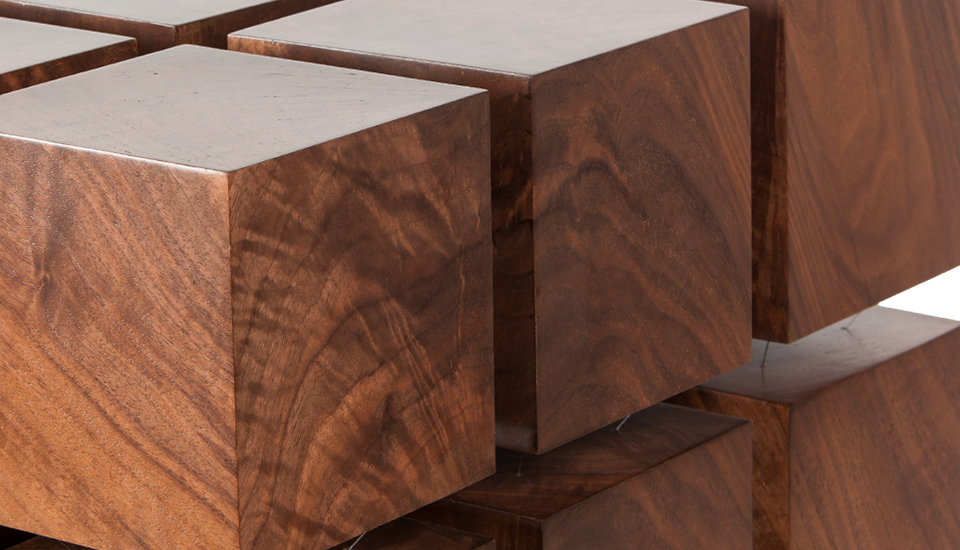
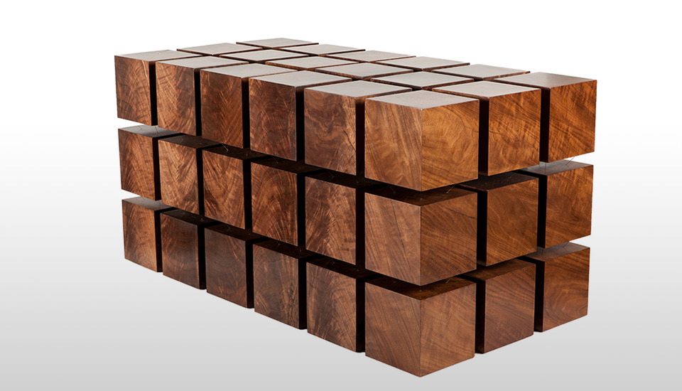
You can check out Furnish in your app store for more details.  I tried it with a few modern pieces, and thought I’d share the results:

Not bad.  The app was pretty good at detecting the orientation it should render the chair in (better than the IKEA app in my opinion), but the scaling was off and required that I do my best to guess what the size should be.  That would be my biggest complaint.  When trying out new furniture, I really want to see how much space it takes up in my room.

Overall I really enjoyed playing with both of these apps, though we still have a long way to go.  I would love to have things render in the correct scale without the catalog trick and to be able to render multiple pieces in one view.  A mashup with Google Glass would be amazing.  And I would be delighted if my other favourite retailers (DWR, West Elm, CB2, Serena & Lily) offered similar apps.

What do you think?  Have you given either of these a go?

(Nope.  Not a sponsored post.  Just some fun geeky times.)

geeking out house tour

geek-out time: our floorplan!

May 3, 2013

(Hello again from Paris!  So sad that our trip is nearly at an end, but I have many things to share with you as soon as I get back home.  Until then, I have to share this post, out of a need to inform you all about geeky things that are imporant to me.)

After we moved in to this house, I became a bit obsessed with tracking down its original floor plan.

What I really, really wanted to find was the original builder’s certificate, which I’d seen in another Eichler garage while we were house-hunting.  I remember it well:  it was a heavier card-stock paper, yellowed with age, with all the details like the parcel number, the builder, the year, the model, and so on filled out in pencil, in a heavy but lovely hand which reminds me of the way our school teachers would write on the chalkboard.  Proper writing.

After an overly thorough search of our own garage which involved getting some gigantic cobwebs in my hair, I passed on finding the builder’s certificate.  I did find a few home inspection certificates of an appropriate vintage stapled to one of its walls, and instead started searching online for the next best thing:  the original design and floor plan.  There are a number of Eichler communities with various floorplans archived, notably on the Eichler flickr group.  My searching did not turn up the exact plan, but I found the closest I am likely to get:

eichler house architect's rendering
eichler house floorplan
Source:  Eicher SoCal

Isn’t it gorgeous?  In a super-nerdy way?  I love the rendering of the front.

The floor plan comes from a subdivision of Eichlers in Southern California, and is just about dead-on.  We have the same carport + garage configuration, four bedrooms, and two baths, situated almost the same way.  The only differences in our house are:

  1. Kitchen:  There is no pass-through from the kitchen directly to the dining room.  The range is on the wall opposite the oven.  And we don’t have the big pantry, but we do have the dish cabinet — in the same spot!
  2. The entrance to bedroom 4 is not at the end of the main hall.  Instead that space for the washer and dryer is rotated 90 degrees to the right, so it ends the hallway, and you have to go around it to get to the third and fourth bedrooms.
  3. We don’t have a sliding door from the dining room to the side of the house.

… and a few other small details, like the way the atrium and back patios are laid out, and the hole in the roof overhang at the front of the house (pictured in the top rendering) — ours is solid.

In case it’s not clear from the plan, the atrium area is open to the sky.  This is probably one of the best features of this house, and makes for some memorable times.  Like when one of our friends’ kids got pretty confused about being inside the house but also seeing the moon straight overhead.  Or when we watched a certain little boy running laps with much glee through the living room, down the hall, out into the atrium and back again through the living room soon after we moved in.  Or how my mom would never know which shortcut to take to get to the kitchen when visiting.  She may have gotten lost once or twice.

I hope this helps sort out how things are laid out, as I take you all through the house.

Did you notice the door from the second bathroom opens to the outside?  We’re still wondering why this was done.  Does your home have any surprising features that you discovered after moving in?