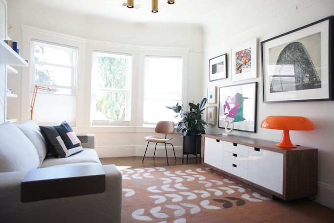
For anyone who’s been following here for a while, you know I’ve been slowly working on a side project with a client in San Francisco. Last month, I installed the final room: a dual purpose guest and lounge room.

Our house is featured on MidCenturyHome today! Head over for the full interview, and some never-before-seen shots of our interior (frantically shot by me while avoiding views of our backyard construction). I’ve been following this site for a while now, and it’s a great place to read about mid century architecture– along with plenty of eye candy. I feel very humbled for our home to be included. Thanks, Marco!
I promised pretty things a while back. Here we go!
We’re getting ready for a very exciting Christmas: hosting David’s family at our house over the holidays. It’s five people more than we’re used to, but I am thrilled to have our house a-buzz with festive fun and activity this year. To make room for everyone, the hobby room is now a guest bedroom.
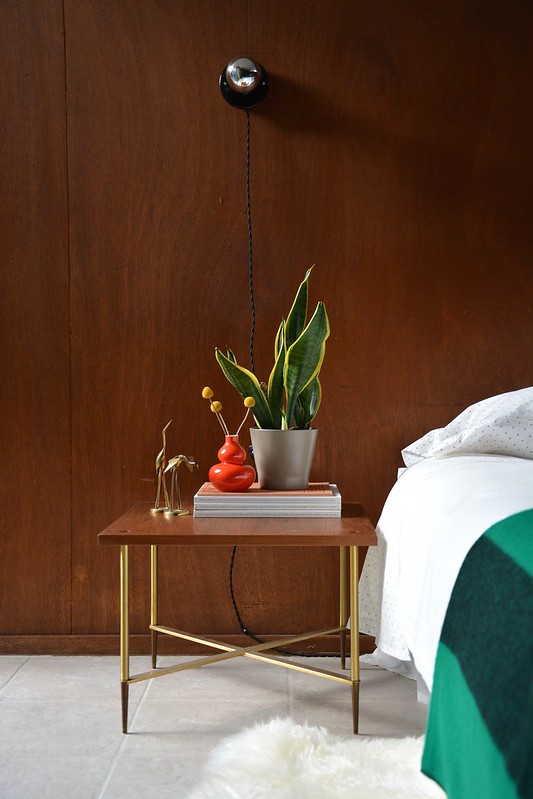
It’s been a while since I’ve had the chance to do a project like this, and I love how it turned out. The room is fun, bright, and cozy. My in-laws will be staying here, so I really wanted to create a space that they would enjoy and feel comfortable in, while keeping it super simple and fitting with the style of our house.
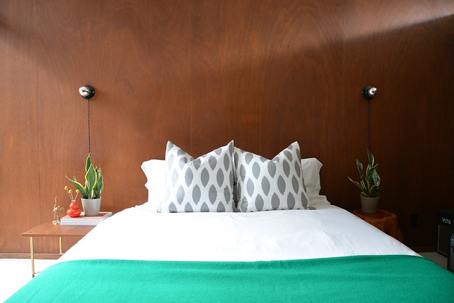
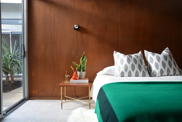
Nothing is precious, and since I have two more bedrooms to set up, I kept it quite budget-friendly for the most part. The main splurge item was the green wool throw, from Schoolhouse Electric, which was the starting point for the rest of this look. I bought new bedding and styled the rest with items from around the house, threw in a few sheepskins… and done!
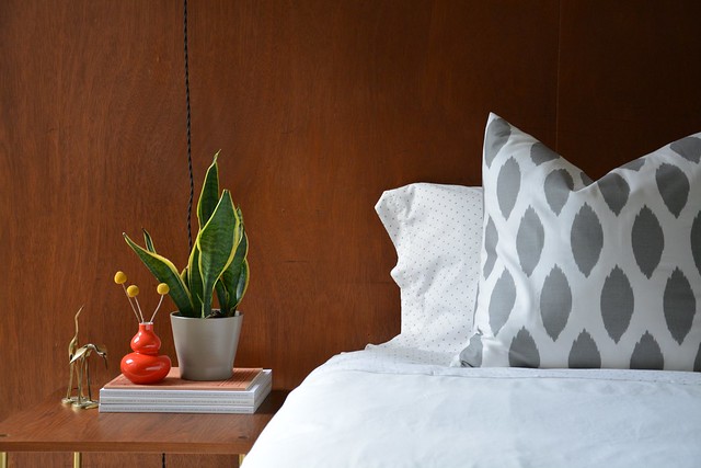
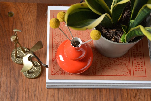
One of my favourite things in the room is this little table. We’ve had it for a while, and I love the pointy brass legs. I’m not sure of its lineage, but I’m thinking maybe midcentury Italian. Any ideas out there?
Here’s the view from the atrium. So it’s not the most private room in the house, but I think it will work. It looks quite cozy in the evening, looking from the outside in.
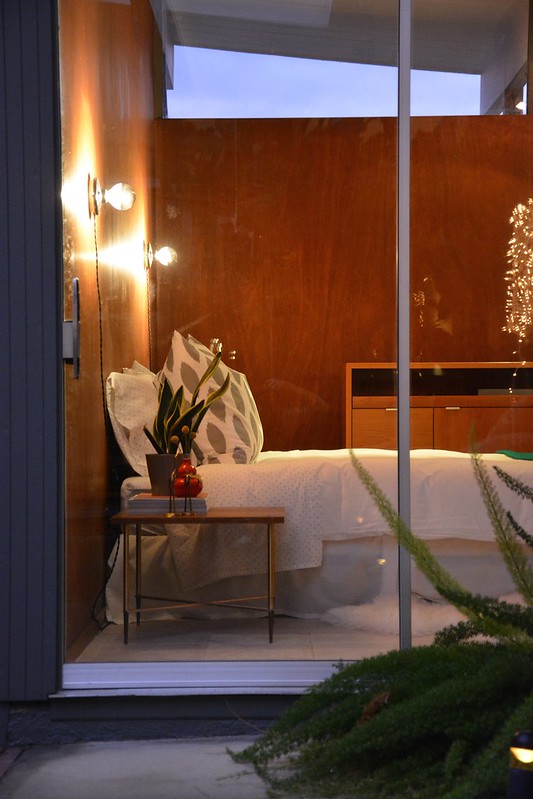
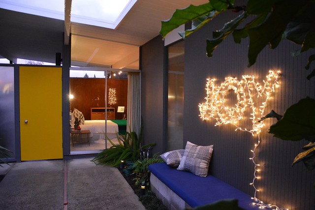
As a bonus, my guests get to admire the atrium Christmas lights before tucking in for the night.
I’m definitely feeling the JOY! Are you?
Sources:
Grey ikat pillows – ElemenOPillows on Etsy
Polka dot sheets and pillowcases – West Elm
White DVALA duvet and sheepskins – IKEA
Kelly Green wool blanket – Schoolhouse Electric
Orange vase – available at Flora Grubb
Brass herons – estate sale find
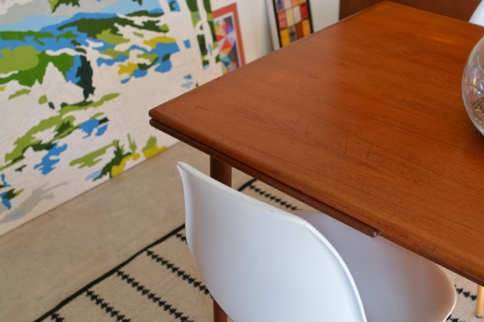
Teak side table – vintage
Sconces – our own creation
JOY sign – our own, you can find similar wire letters here and add mini lights
Now that we’ve sorted our closet door situation, I’m back to considering some significant changes we want to make to the house. When we bought the place, we figured we’d be good for the next five years or so before doing anything big. Rookie homeowner mistake. We’re such optimists.
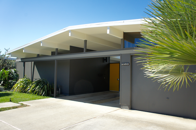
Last year our backyard gate fall apart. We mended it and it’s now functional, but should ultimately be replaced. Now, we figure if we’re replacing the gate, probably we should do the fence while we’re at it. And upon closer inspection the fence really does need help! Change the fence? Maybe fix up parts of the yard too. Fix up the yard? Probably also the siding, so it doesn’t detract from the landscaping. Change the siding? Well, then maybe it’s time for new house colours. And in an Eichler, that means painting both exterior and interior at the same time.
I give you: The Great Home Improvement Snowball Effect.
Let’s take some deep breaths. Better.
Some of you may be wondering why I was painting things white lately, and this is it. We’ve arrived at a point where we may be changing a lot of things. The one I’m currently pondering is the colour situation.
It’s not all stress-induced however. Thanks to my work sabbatical, I’m feeling a lot of love for California lately and especially for the light we get down here. This is all helping me focus on what I want conceptually for our house: I want it to feel like we live in California. Bright. Not too serious. Connected to nature.
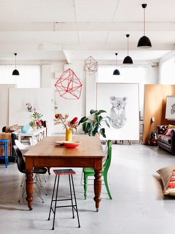
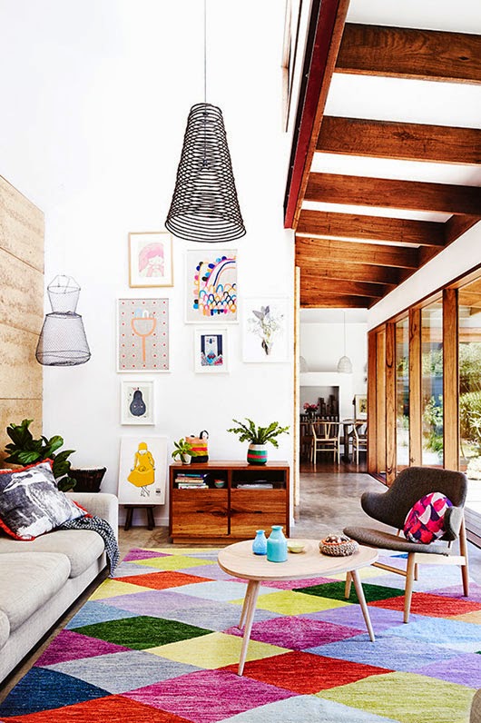
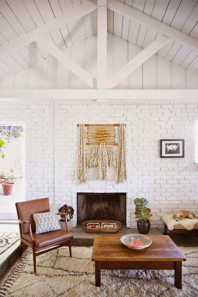
These interiors are inspiring me lately, and I thought I’d share.
For now, I’m going to try and nail down a colour scheme for our house. Maybe just a shade of white to start. Small steps. And we’ll get to that broken gate eventually.

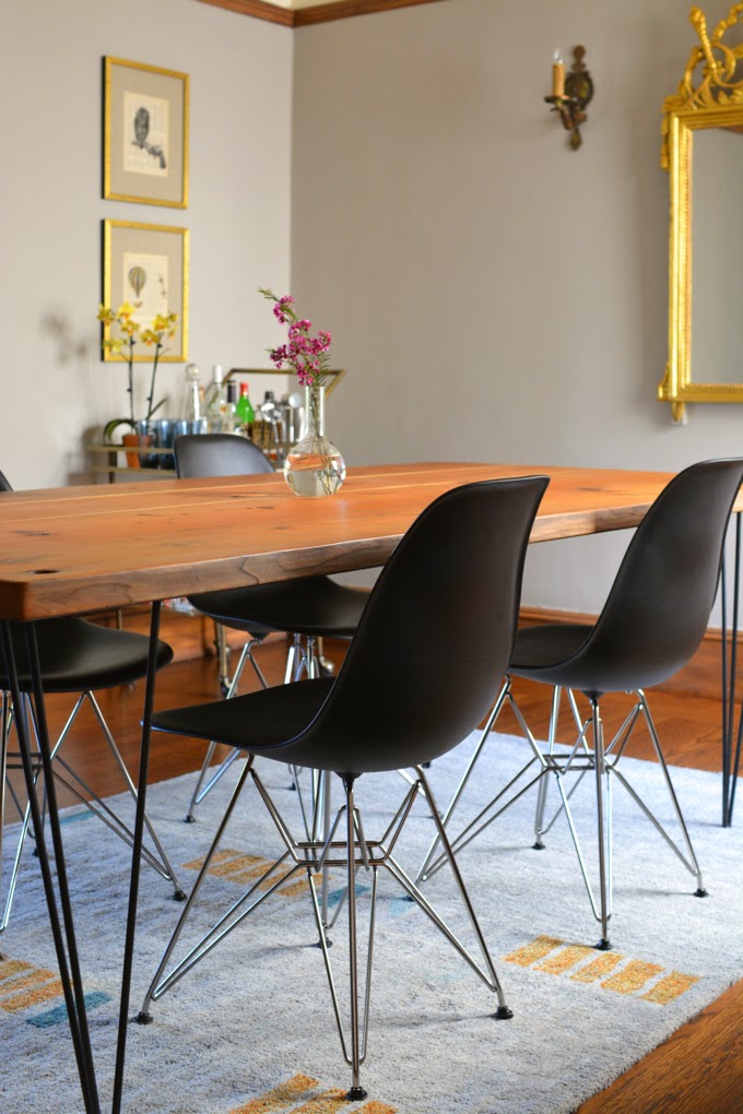
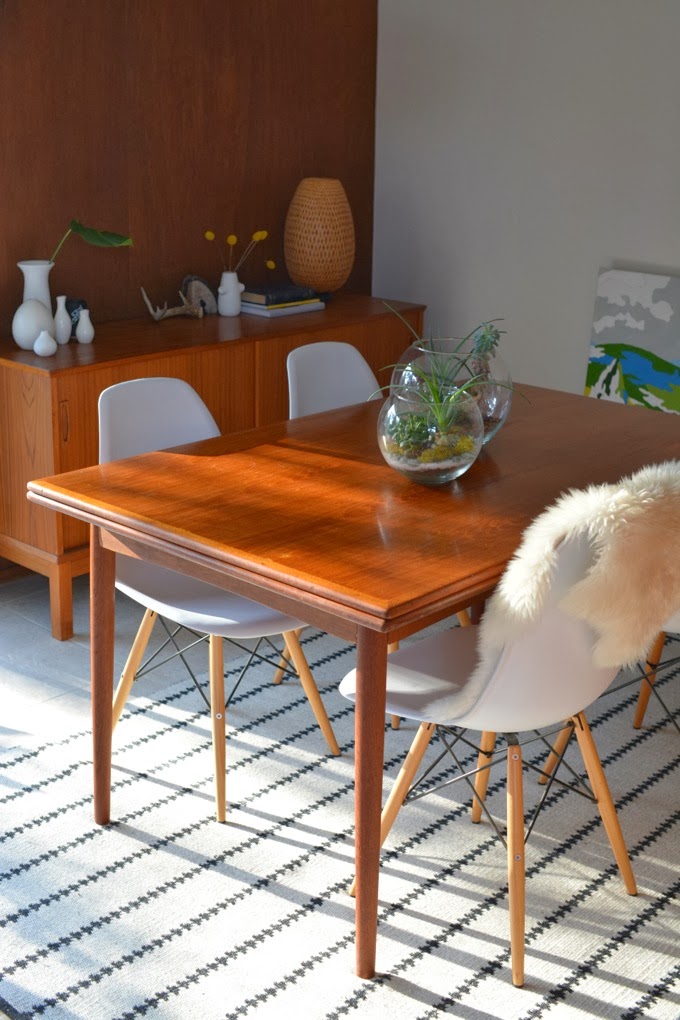
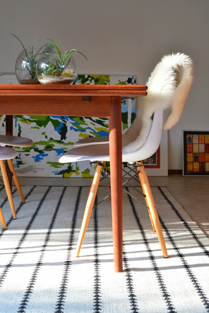
I’m very excited to share another peek at my client project with you! We’ve just finished the dining room of their lovely 1920s home, located in the Mission district of San Francisco.
This dining room had some great pieces to start with, but needed some polish. I’ve omitted the before shot this time, but the Eames chairs, the art, the rug, and the amazing raw wood table are all theirs. These folks have a great sense of style, which is one of the many reasons I love working with them. And getting to explore their gorgeous neighbourhood is definitely a bonus.
When we started this part of the project, they had some pretty specific requirements for me to go after, which included finding the perfect antique mirror for the space. I’m thrilled with the mirror: it’s authentic (circa 1900), totally them, and a real conversation piece to boot.

Glorious, isn’t it? This mirror may be my favourite purchase for this project so far. I love how it works with the modern table and chairs.
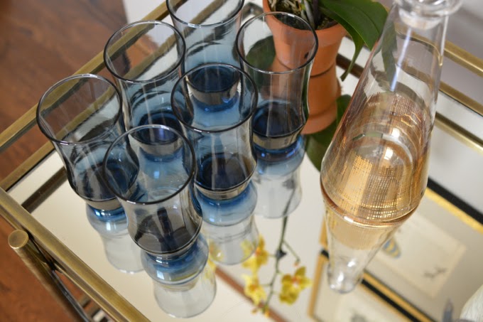
On the same wall as the mirror, a hefty black bar cabinet was replaced by this very sweet bar cart. The mirrored shelves and delicate lines give this cart a refined look. We originally missed out on this same cart in a true gold finish, but I feel like the subdued brass keeps things from looking too over-the-top. (And stay tuned – I’ll be sharing all of my other bar cart picks in an upcoming post, for they are plentiful. My secret pinboards are brimming with them.)
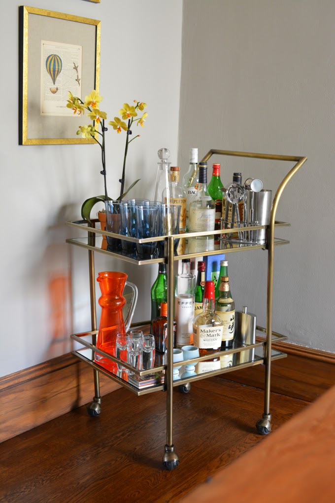
A new buffet is now below the large abstract art piece, styled up with a mirrored tray which echoes the bar cart’s shelves. Repetition is a great tool for unifying your space. As is restricting your colour palette (one of my great learnings from AB Chao). I tried to be very intentional about these elements in this space, while incorporating my clients’ pieces, like the bright orange pitcher on the bar cart, and still having a bit of fun.
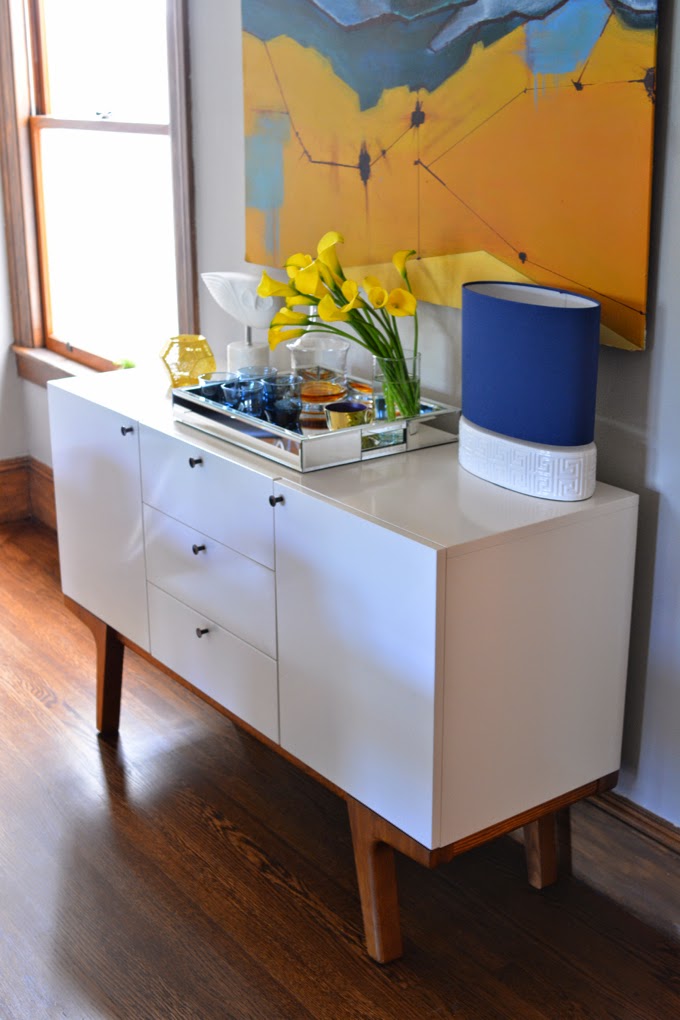
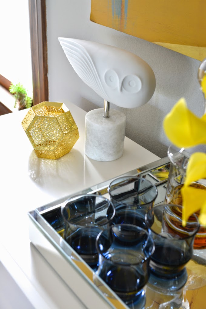
To style the buffet, I ended up using just one lamp instead of a pair. I am pretty sure this is breaking some sort of sacred design rule. But what fun are rules if you can’t bend them a bit? The lamp is balanced by the owl sculpture, so it works quite well to my eye. The mirrored tray keeps things corralled and organized. Trays are a great styling tool if you have a collection of objects to display.
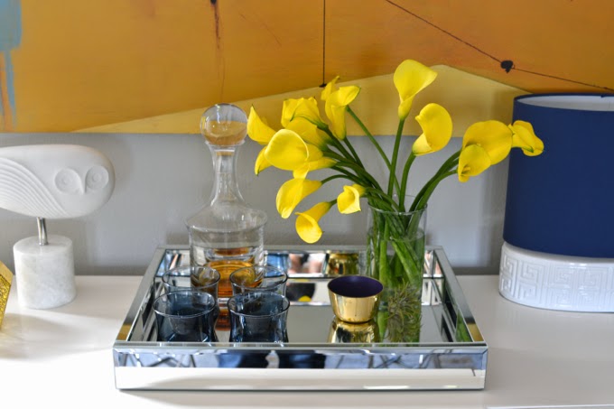
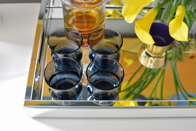
And there are those blue midcentury tumblers again. Repetition, yo. It works.
And that’s all for now. We still have a few more rooms to tackle in this project, which I’m looking forward to. I hope you’re enjoying this as much as I am, because there’s more to come!
All photos by Karolina Buchner

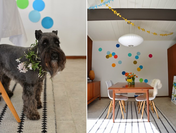
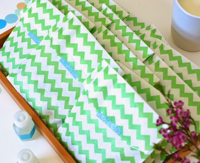
Well, hello! It’s been a while since I’ve updated here, and I thought I’d share a bit of what’s been going on at our house. Lots of happy stuff actually: I threw a baby shower for my dear friends who are expecting a baby boy in May. I am so very excited for them. I love dressing up our place for parties, and managed to snap some pictures before and after so you can have a peek at the fun too.
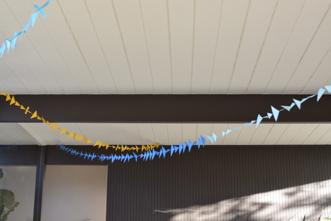
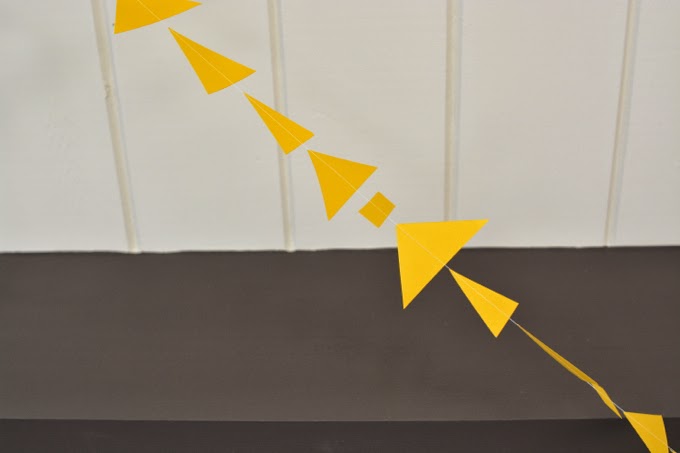
The decorations were largely inspired by Emily Henderson’s triangle-themed baby shower, though I didn’t go all out with the triangles. I did make garlands to dress up the living room and atrium. They are super easy: just cut out shapes from card stock and feed them through your sewing machine.
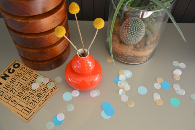
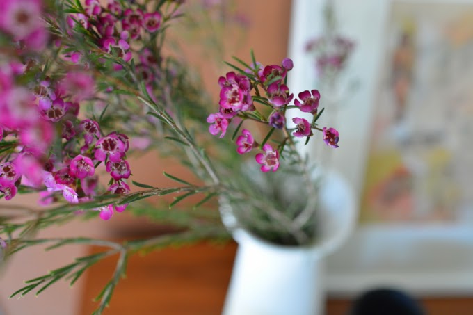
To add more colour, our dining room wall got the giant confetti treatment (you can check out the tutorial here) and I scattered (normal-sized) confetti on every surface I encountered while setting up. Even the dog got some festooning. I picked jasmine from our yard, and added wax flowers, daffodils, and ranunculus in vintage jars on the table.

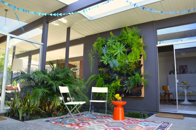
We had some gorgeous weather for the party, so I set up an outdoor seating area for our guests to enjoy our atrium and its very wild living wall. (I love how crazy this thing has gotten.)
The best part of course was catching up with the awesome parents-to-be and everyone who came to celebrate. We played games (some serious baby-knowledge-testing trivia), collectively crafted up a yarn pom-pom garland for the baby’s nursery, and ate lots of good food. I got to reprise my Polish rice with plums and made these great ricotta crostini with an assortment of toppings.
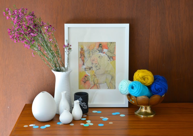
The pom pom making was a hit even with the guys (it was a mixed shower). Even all those little yarn bits were quite pretty and made me a bit sad to clean up. I really enjoyed the combination of teal, cobalt, and yellow on my coffee table.

I hope this inspires you to embrace spring and colours that come with it. Even if it’s still freezing where you are. Or gloomy and wet like it was here today. I have a feeling it will be summer before we know it.
All photos by Karolina Buchner
The space needed to be pulled together and livened up. We went with a fresh colour palette that worked well with the existing neutrals in their space and added some pop.
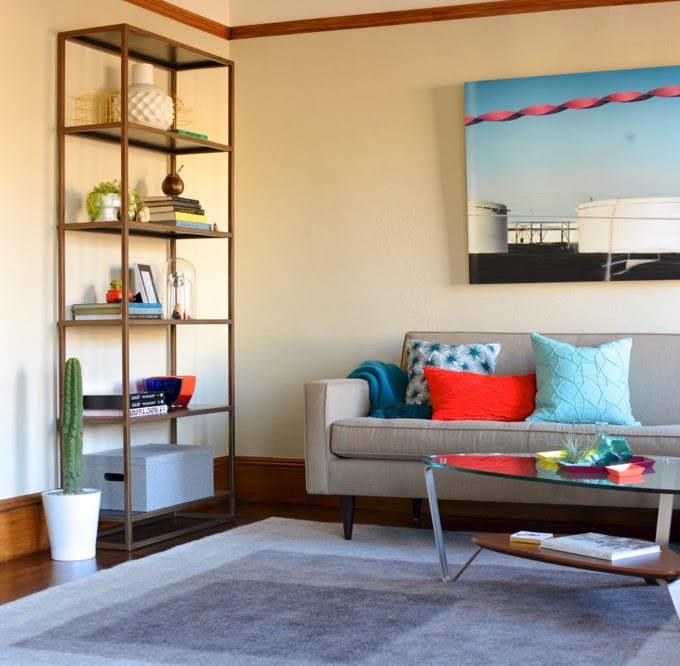
The rug really changed the look of this area. The grey is much quieter and plays well with the cooler tones of the pillows and art. Plus, it’s felted wool, so it’s both cozy AND indestructible.
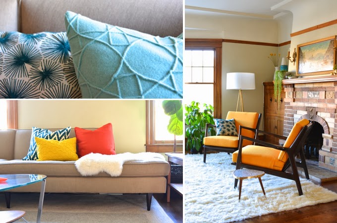
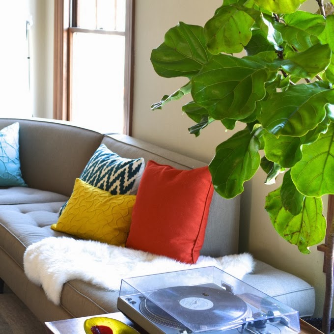
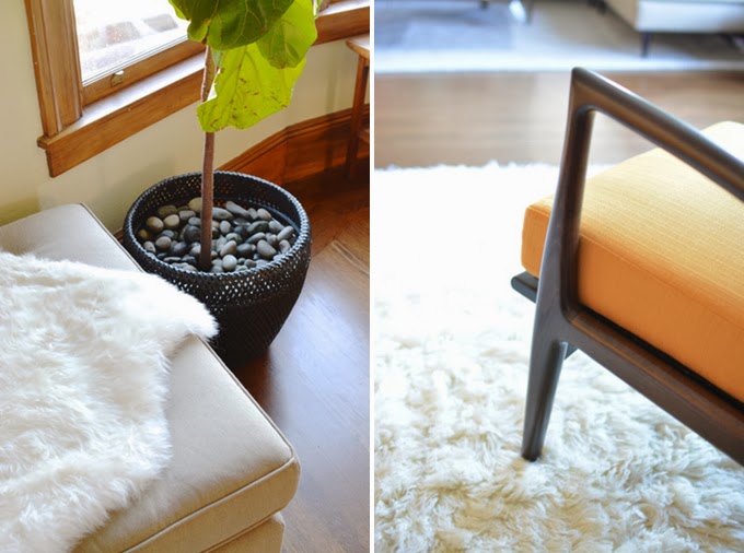
Sources: Remi bookshelf from Crate and Barrel; Littlebox grey wool rug from Peace Industry; art by Heidimatic; teal throw and cushions from CB2 and West Elm; Thrive Eisenhower chairs in Klein Citrus fabric; adorable teeny mid-century tripod table from Lunartics on Etsy; sheepskin and woven planter from IKEA; Jonathan Adler Ohai floor lamp; coffee table is the clients’ own; sectional from Room&Board
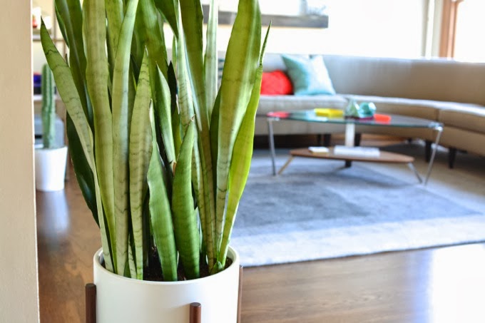
Sources: snake plant and fiddle leaf fig from Green Design (I love this place – South Bay friends, check them out!); mid-century ceramic planter from Modernica; teal California pottery planter (pictured here on top of the tripod table) from a local antique mall
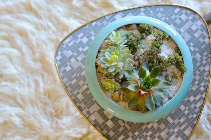
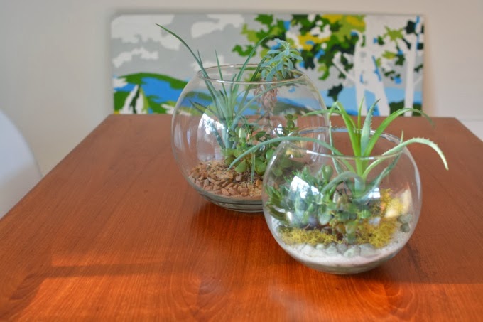
Of course, things would not be right without an air plant in here somewhere. I found this huge one at a garden shop in Berkeley, and love this vista from the coffee table to the fireplace:

Sources: aqua vases from IKEA and CB2; Kaleido trays at DWR
I’ll have to leave you with that for now. More things are still to be added, including a very exciting order we’re waiting on from Knoll. I’ll be updating after our next phase. I can’t wait to share!
We finally painted the dining room + kitchen this weekend! You may recall my big plans to paint things a dark, deep blue. After trying out a patchwork of colours on top of the recent dark green, things took a dramatic turn … for the brighter.
Yep, it’s WHITE.


I decided to go for white after some very, very deep reflection, a.k.a., browsing my pins. I have to admit I’ve been having some bright white envy after seeing the homes of Emily Henderson and fellow Eichler owner Traci Yau of 45wall design. And I rather enjoy treating my home as a sort of lab for design experiments! I’m starting to scheme about painting out all of our dark brown beams and brightening the ceilings, which are currently really off-white.
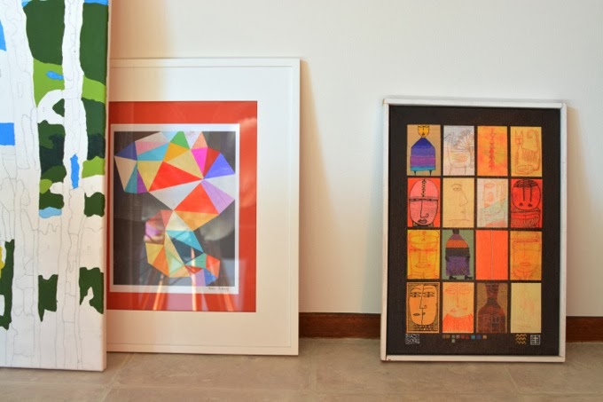
Anyway, back to the space itself: To keep things light, I flipped the Nate Berkus rug to its reverse side. The credenza is now off to the side, just to mix things up a bit, and the art is obviously a bit scattered for now. I’m pretty keen on getting a huge art piece for the white wall. I’m in love with the work of Samantha French – her large-scale underwater portraits are stunning, but I might let my eye wander a bit first. Suggestions for big, abstract-ish art are welcomed!
I’ll update on the kitchen and breakfast nook once I’ve had some time to style them a bit more. In the meantime, I’d love to hear what you all think.
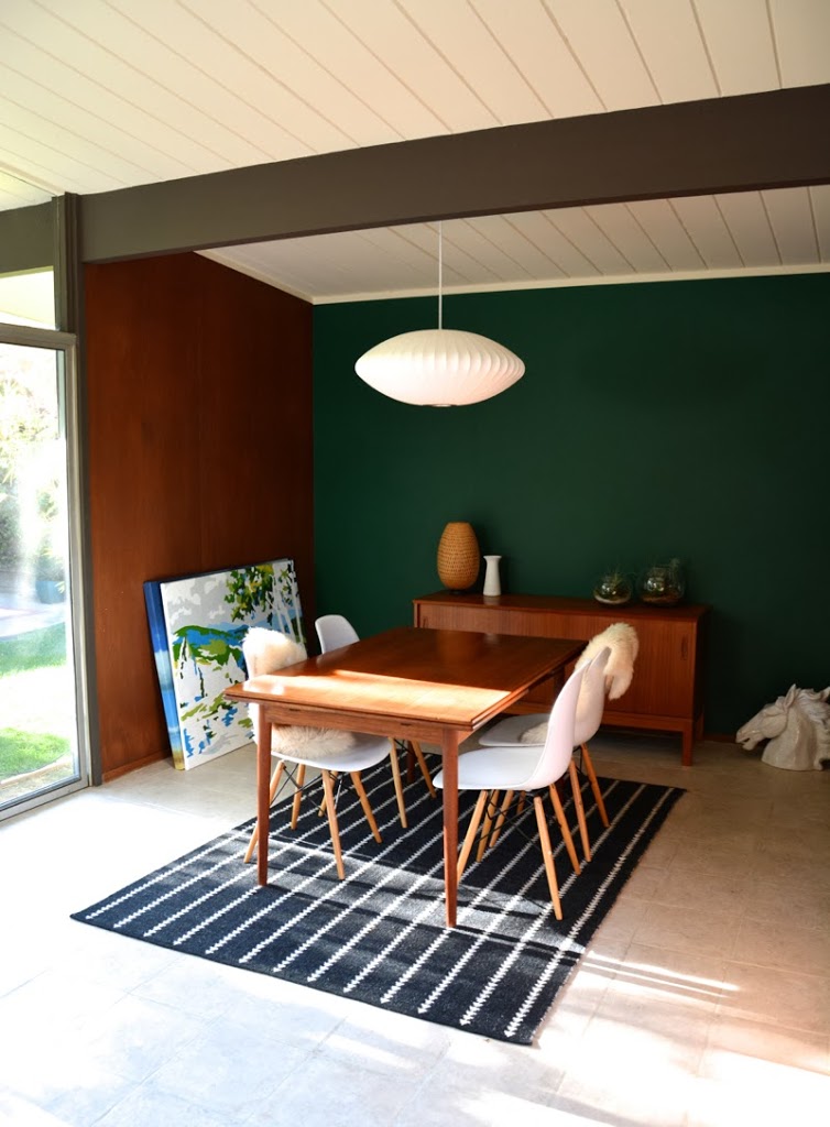
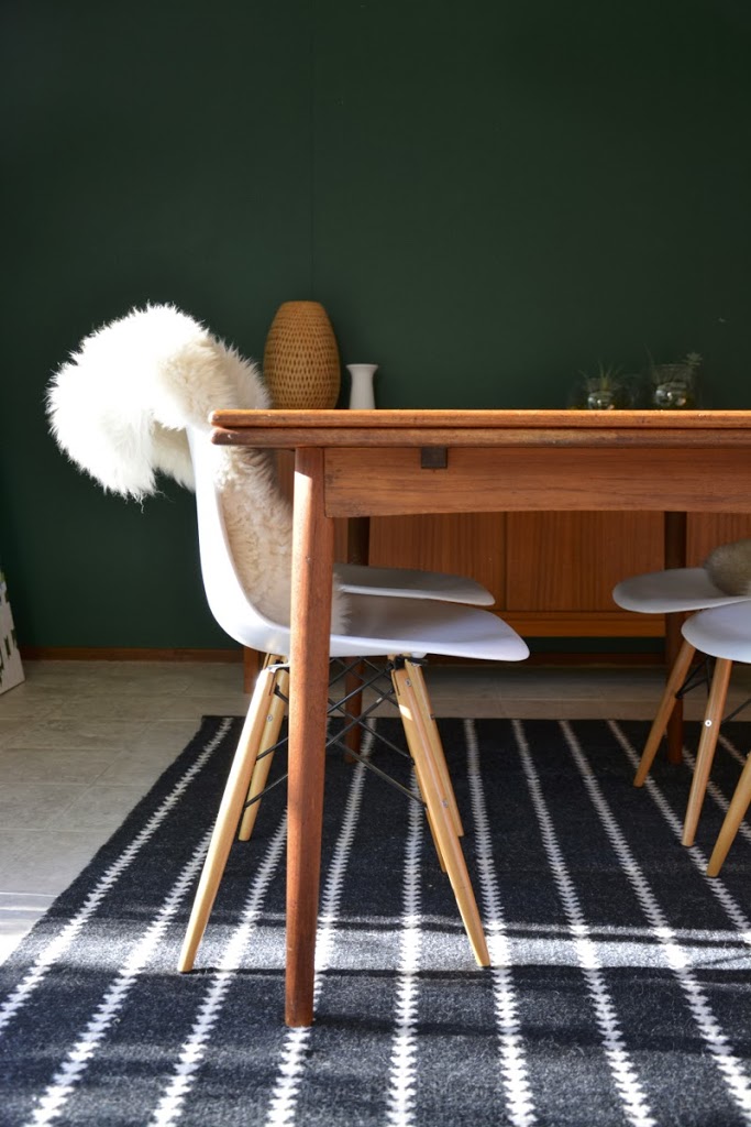
Hey guys. I realize I haven’t been a very entertaining blogger, pinner, or instagram-er lately. I got sucked into a sort of alternate universe on tumblr, in addition to the usual life things. Alas, for those who follow me on Instagram, I thought I’d do a little reveal of my latest experiment at home: repainting our dining room.
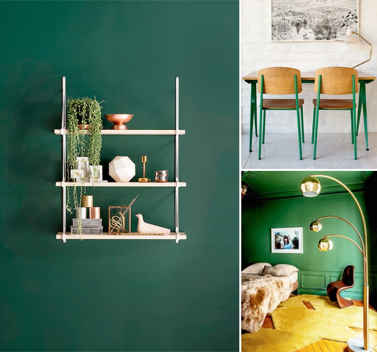
Hint: It’s very green. Why did I do this? Boredom, I suppose. I wanted to change something, and I’ve been inspired by all of these greens lately:
 |
| Photo sources: 1 | 2 | 3 |
I love the way that white, wood, and gold play off of the greens above.
Here’s the result. (More or less, because it’s impossible for this green to look the same in any two pictures!)
I thought I’d share this as I feel it’s not a very successful experiment, and I am quite likely to repaint. But you, dear blog follower, get the inside scoop before this disappears!
The problem is two-fold.
One: the green doesn’t exactly play nice with our wood paneling. As my mother warned me not to “make it look too much like a forest”, I managed exactly that. It’s intensely woodsy. Maybe this is good, I’m not convinced yet. The worst part is the mahogany trim that runs along the bottom of the wall. I feel like this makes things look dated.
Two: it is hella dark at night. And I can say that because I live in California. The person who I happen to co-own the house with does not approve. The mahogany paneling is dark enough, with the green it is now (his words) “cave-like”.

Still, I am enjoying how the white chairs (now adorned with sheepskins) and the bubble lamp stand out against the green. It might grow on me. Stay tuned.