
So, yeah. It’s been slow. Sorry to have left you all with that Miyazaki monster for so long.
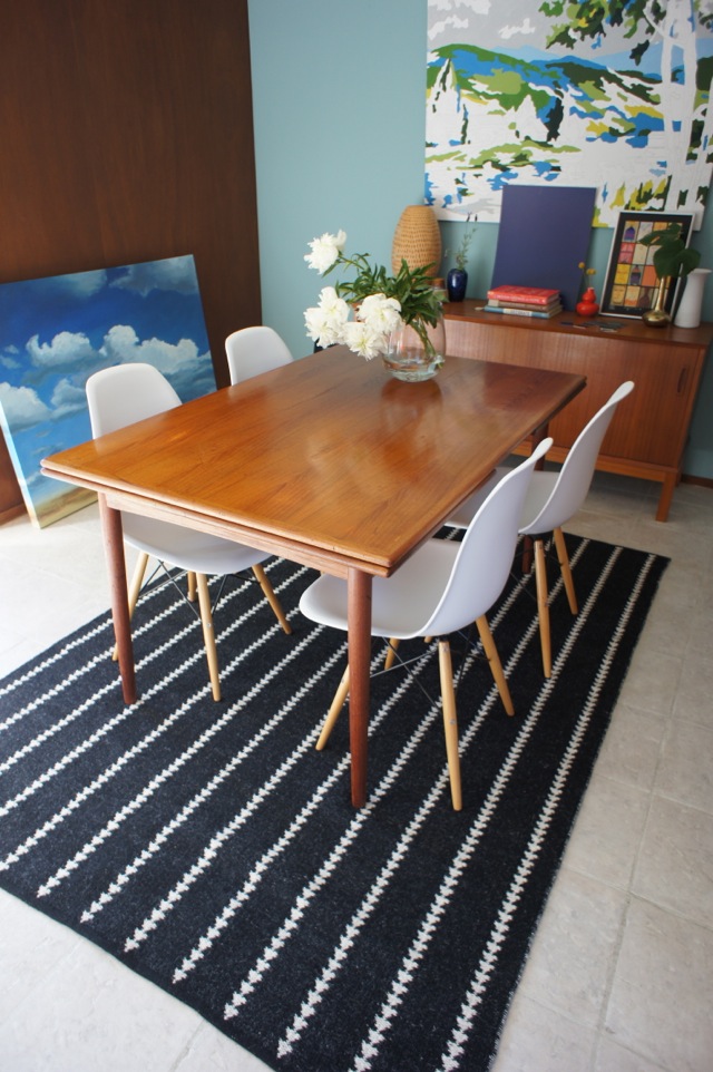
Progress: we have a rug!
Anti-progress: I am having cold feet about the wall colour.
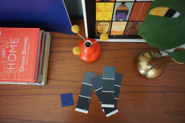
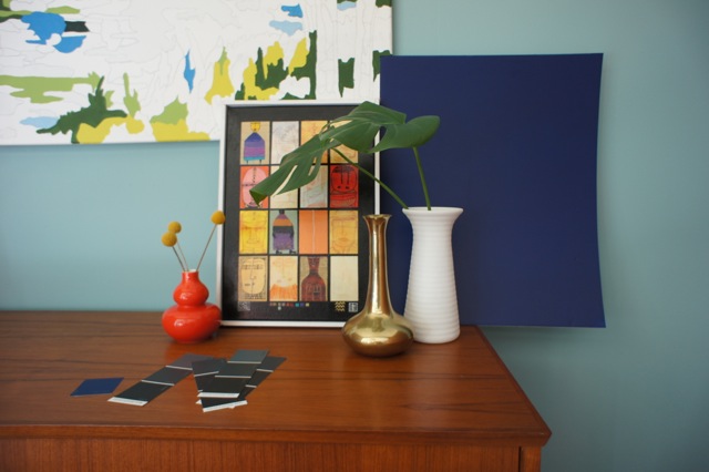
This last weekend, I got a piece of foam-core board and painted a big piece with the Admiral Blue paint that I’ve been pining after. It’s an awesome deep indigo blue.
Look how great a backdrop it makes:

But it looks almost black in low light. I’m a bit concerned that with all the mahogany paneling, it might be too dark.
I have also turned our kitchen into a paint-chip laboratory. I am constantly walking by squinting my eyes at all the chips, trying to get a feel for what they’d be like on a larger scale, in case I want to try a variation of dark blue. And I’m still not sold.
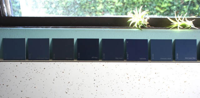
I just might go white for the walls. Or light grey. My brain is going to explode, people. Please send your decision-making energies my way. Thanks.
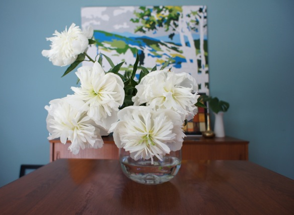
While you do that, here’s a bonus shot of some peonies because it’s peony time! I love these. Most of all, because if I ever wonder which peonies to get, the answer is usually ‘just get ALL the peonies’. I had two bunches in my house this past week (one white, one super dark pink), and I’m thinking I might pick up a few more.
You should too. I’m pretty sure they’re proven to lift the even most decision-burdened of spirits.
5 Comments
Amen to all the peony action. The answer is always yes to peonies!
I feel your paint picking pain. I loooove the admiral blue. A couple of thoughts : trust your gut (your gut has quite impeccable taste, in my opinion) and also, I know everyone says it and I always kind of roll my eyes, but paint can be changed relatively easily and cheaply if you don’t end up loving it.
I painstakingly thought out, over thought and over analyzed my paint choices when we bought our house – I freaked out as I painted all my walls – and over 6 years later I still love my choices.
I can’t wait to see what you choose – I know it’ll be awesome.
Good advice Hannah! I have to say the same. I spent so much time and stress choosing our paint colors (and really I had to find different shades of white/eggshell/cream for 1) doors/trim, 2) ugly bathroom with random blue tile, and 3) ugly bathroom with random pink tile), along with a different color in every room. And I love all of them too! I was a bit concerned about the wolf gray we chose in our bedroom and the warm stone color in our living room, bc they’re both dark, but I have not regretted it, especially because they’re large rooms with lots of sunlight during the day. Sure at night it’s darker, but it’s night so i don’t notice it. AND you can accent/do something fun with some beautiful LIGHT…it just might inspire you!
Have you tried the virtual paint your room tools? The tones change depending on the light again, but it helped me gain more perspective, hence I felt I had more info, hence I felt I was making a decision based on all the info I could possibly have.
Can’t wait to see what you choose too!
PS. The closeup shot of the Admiral blue with the books is A-MAZING.
I agree; that Admiral blue is stunning! I have been going through the same exact exercise for our Master Bedroom; I went with a color blue (sapphire) that has a tinge of Royal in it, but depending on the light can also be a dark navy blue, which is what I originally envisioned. I have been so hesitant to go bold blue for all 3.5 walls…(.5 being windows wall) but I decided to just go for it. Will post pictures.
PS. Love the tip to paint the foam core; I just put the tiny paint chips up behind my headboard… but they were so microscopic. I’m too impatient though and just had to go for it! 😉
Wow…foam core tip…one of those things one can’t believe one never thought of before! How cool!
What about a greyish-blue? Grey is a sophisticated neutral and can lean either warm or cool. In this case, you still get your blue, but maybe what makes you uncertain is the “primary colors/a bit Crayola” of a deep blue. Grey it out a bit and it’ll tone down, but your oranges and woods will still stand out.
[…] finally painted the dining room + kitchen this weekend! You may recall my big plans to paint things a dark, deep blue. After trying out a patchwork of colours on top of the recent […]