Browsing Category

interiors

interiors

quiet design

September 8, 2013

As much as I love colour, as summer comes to a close, I am finding myself drawn to quiet, clean design lately.  This may be compounded by the fact that I just burned through a certain BBC television series which ended on a very sad note.  Suddenly I’m craving foggy mornings.  And tea on foggy mornings.  Tea on a foggy morning whilst wearing a slouchy grey wool sweater is kind of a dream of mine right now.

I find gloomy weather to be more relaxing than the every day get-out-of-bed-and-go-go-go! sunshine, which we’ve been enjoying just about every day since last January.  I like my melancholy and quiet, even if it may not seem like it by the large number of exclamation marks I use at times.


I’d love to go in this direction style-wise for our house at some point, but there’s something about the fact that we are here in happy and bright California which prevents me.  Maybe one day when we relocate to a northern climate.  Or perhaps I’m just itching for a trip to someplace with real weather, rather than endless (unmercifully) clear blue skies.

Have a good weekend everyone.  It’s going to be a hot one here, so I’ll be going to these spaces in my mind.  Maybe curling up with a book and thinking of rainy winter days.

Photo sources:
1 | 2 | 3 | 4 | 5 | 6

guest room house tour interiors

house tour: guest room

June 27, 2013


As a respite from that ugly beam (sorry guys), I thought I’d continue with our house tour and share my favourite room with you:  our guest room.  I love that it’s cozy and kind of its own little world.  It’s on the small side, just about 10′ square.

Here’s what the my rough plan for the room looked like, back in the day:

guest room

The Danish wall hanging was the jumping-off point for the neutral and warm palette and accessories.  It was featured on the Etsy blog as a pick by Morgan Satterfield of The Brick House, and given how much I love Morgan’s style I probably deliberated for about thirty seconds before buying it.

When we don’t have overnight guests, which is most of the time, this room is my little hide-out. 

I really love the light that comes in here, even if it’s only a few short hours a day, especially when it’s all dappled through the matchstick shade.  It’s very satisfying to sit in on a sunny weekend morning with a cup of tea and my magazines (ok, they are mostly catalogs).  I get to take in the light without feeling too guilty about not being outside bright and early.

While the basics of the room came together pretty early on, I’ve been tweaking it here and there.  The above sunny shots were taken early on in the process, and I couldn’t help but to include them.  They’re so bright and happy!  Having recently added my staghorn fern mount and a few accessories, there’s more dimension to the room now and I’m liking the feel of it.

Resources: Bassett side table from Midcentury Mobler; stump side table from West Elm; rattan tray from Crate & Barrel; sheepskins from IKEA; Danish wall hanging from Project Sarafan; midcentury ceramic lamp from Loverly Vintage; kilim pillow cover from Sukan; onyx-marble polyhedron from Sky Parlor; cacti screenprint from Banquet Atelier; bud vase from Heath Ceramics

I realize there is some inconsistency across these shots but I keep messing with things and then re-shooting.  And it’s a teeny room to try to shoot!  I basically have to smoosh myself in any void possible to get head-on shots of furniture.  Anyway, enough sobbing.  I love my teeny room nonetheless.

Of the things I’m not quite satisfied with, one is the rug.  The IKEA Beddinge sofa I guess I’ll live with (it is comfy for sleeping), but the rug I can change.  I enjoy that crewel-work rug tremendously and got a super deal on it at Anthro a few years ago, but it doesn’t really fit with its gigantic paisley pattern.  And, after seeing some great patterns around, notably on Design*Sponge, I am considering some options.

You know what that means . . .

Rugs clockwise from top left via Old Brand New / Overstock / Overstock / Imogene & Willy

The Navajo patterns are so good.  All those triangles and great colour combinations.  I will let you in on a secret though:  the kilim rugs on Overstock are surprisingly great.  The one in our dining room previously came from there, so I’m quite tempted to take another gamble and try.  Vintage rugs are so lovely, and definitely have a different feel to them, like the beat-up one captured by Dabito above.  Still, the third rug in that set looks pretty fantastic.

Perhaps I could achieve the worn-in look by letting Winston spend some time with my new rug?  Sounds like a plan to me.

Photos (except rugs) by Karolina Buchner

interiors projects

yahoo! labs

June 11, 2013

dear house,
sometimes i can get all crazy and design and paint and furnish whole floors of other buildings!
i know, i scare myself too.
xo
karolina

I’ve been meaning to share this side-project I did last year:  I designed a new space at my office!  Those of you who know me well, know that I work for a certain Internet giant, which has seen its share of rough times and a renaissance of sorts at about the time I did this project.  I just passed my 7-year mark there last week, so this seems like good timing to share!

First, some back story:  Mid-last year, the head of lab was relocating all of us (or, erhm, what was left of us) to a new floor on our main campus, and soliciting ideas for how to improve the space and make it our own.  I sent a few thoughts by email and somehow ended up volunteering to take on the whole project.  In my spare time.

This involved creating a new lounge space for people to hang out in and discuss ideas (whiteboards are critical in such places), a library area to house all three million of their old computer science tomes, and a general refresh of the hallways where our cubes were located.

Somehow I was lucky enough to be given a pretty free rein with what to do with the space, within reason and without major reconfiguration.  The most enjoyable part was completely gutting a conference room and turning it into a super-geeky, super-fun lounge space for my fellow scientists and engineers.

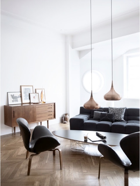
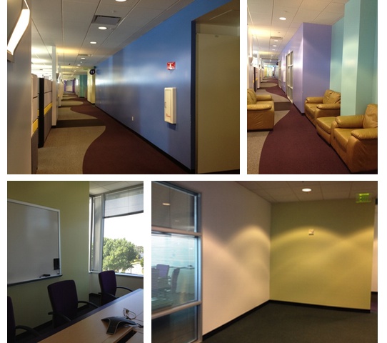
Here’s what we started with:

Yawn.  And dark.  And …. ew.  I secretly want to know where the inhabitants of this space found the baby-poop-yellow leather chairs.

I went through some rounds of consulting with my ‘clients’, i.e., colleagues and managers, and pitched a look including full-on mood boards and pins, colour schemes, furniture options, and budgets.  I had a blast and I think they did too.  I don’t think research scientists tend to review interior design proposals very often and were quite amused to do so.  It was great to have something fun for us to rally around and to see the transformation take place.

Enough background.  Let’s have at it, shall we?
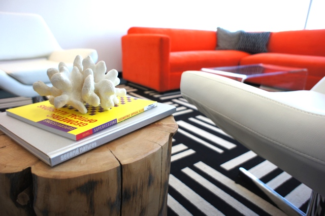
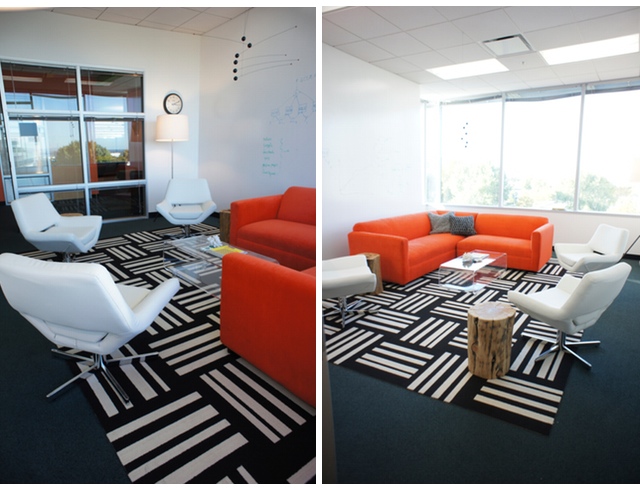
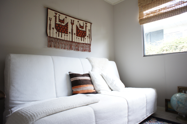
The lounge room:

Yeah, take that boring conference room tables!  For reference, this is the room pictured in the bottom left of the before shots.

So what’s in here?
 
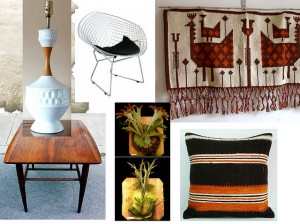
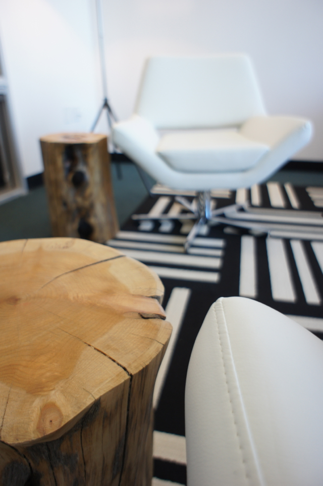
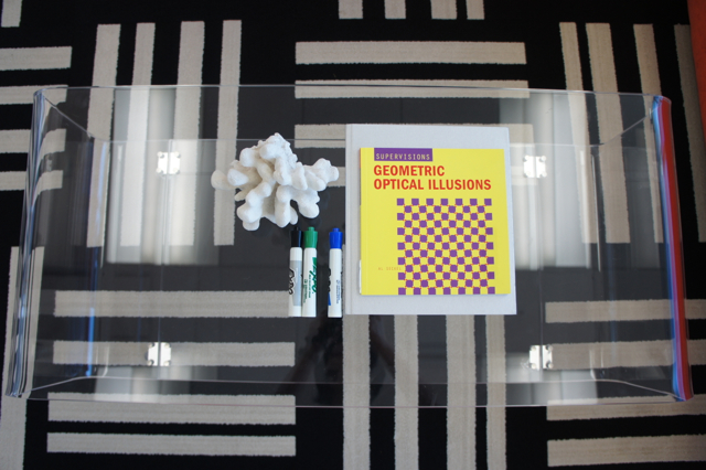
The orange sectional was from our office furniture inventory and the starting point for the room design.  The white chairs came from AllModern and I could spin and spin in them all day if given the chance.  Clear acrylic coffee table actually sold as a media console is from CB2.  The throw cushions and tripod floor lamps were also from CB2.  Wood stump side tables from West Elm.  FLOR tiles are the ‘Dashed Off’ style in black and white.  I looooove these and they really made the room.

We also got a big ol’ fiddle leaf fig tree installed behind the sofa, after months of waiting for it.  Sadly it is not pictured, as my patience ran out and paranoia about things becoming disheveled set in around the time these pictures were taken.  Please imagine it in all of its green, figgy beauty in the corner on the left.

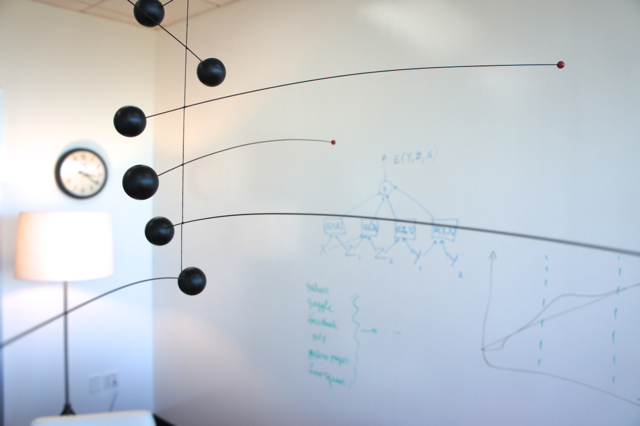
My design geek heart is happy that I got to incorporate the Flensted mobile.  It acts as a sort of chandelier to add a bit of dimension to this otherwise white box.

Speaking of white:  you’ll notice we ripped out the whiteboards.  To make sure plenty of brainstorming could happen in here, we painted the two main walls with IdeaPaint, which turns the whole wall into whiteboard.  It’s been holding up really well and gets used a LOT.

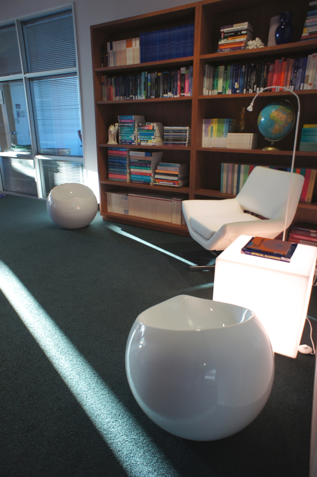
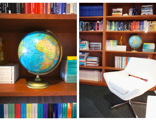
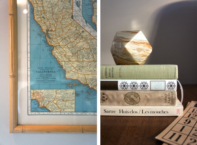
Another space was this little ‘library’ corner also nearby the lounge room (pictured before in the lower right).  This is in an area next to a bunch of conference rooms so it’s generally quiet.  A nice place to take a break away from one’s cube and read up on machine learning theory and computational linguistics, as you do.

Resources:  Lightbox table from Gus*Modern; white chair, AllModern; awesome spherical stools from Zuo Modern via Amazon; floor light from IKEA; globe and other accessories all thrifted; bookshelves from our office furniture inventory; scientific tomes all property of Yahoo! Labs

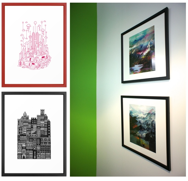
Throughout the halls, after taking painting most of the dark, dingy stuff out in white, we added some blocks of bright colour, chalkboard walls for more collaborative scribbling, and art.  I got a few prints from Society6 which I really enjoy to add interest without being overly rah-rah motivational or corporate, plus they came framed which made things very easy.

The red print is Kuala Lumpur by Steven Toang, the black Scandi-style print by Marcelo Romero, and the two technicolor landscapes by Tchmo.

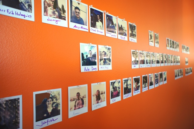
We also started a tradition of taking everyone’s picture and adding it to the big ‘wall of fame’, with a janky old Polaroid camera and film made by the Impossible Project.  Now when any new folks join, getting their pic taken is part of the welcome.

That paint colour, by the way, is Outrageous Orange by Benjamin Moore.

A huge THANK YOU for her advice and support goes to Alena Wallace, who is an actual designer and was super sweet about letting me try out my ideas.  The FLOR tiles were Alena’s suggestion and added a certain 2001: A Space Odyssey feel to the lounge that I love so much.  Alena, you rock!

I look back on this and think I was totally crazy to do it.  Almost all of it was done after-hours, except where contractors were involved and when colleagues were conscripted to help with furniture assembly.  I thrifted for props to style bookshelves and arranged them on a weekend.  On a weeknight, I got my husband to assist with installing things and hang up the prints.  I agonized over paint colours in my sleep.   I stalked our real estate and workplace team to get approvals for my plans (and was so lucky that they were cool with it).  And I had waaaaaaayyy too much fun.

And now when I see my colleagues having brainstorming sessions in that room, using the whiteboard walls, spinning around in the white chairs, I feel all warm and fuzzy inside.  I would totally do it again.

interiors travel

palm springs: a house visit

April 3, 2013
sunlit banana leaf, rug and chair, teak chest, vintage clockmodern house at night


dear house, 
i love you, but sometimes i see other houses.  
if it helps, they do look quite a lot like you.
xo
karolina

Oh, I am so mean.

Sometimes there are some really nice houses that I just have to visit.  Like this Racquet Club Estates house in Palm Springs where we stayed for a mini-vacation a few weekends back.  And friends, it was very nice indeed.

The house is an Alexander, decorated in what the rental listing calls “organic earthy modern”.  I really liked this concept, very fitting for a modern house in the desert.  The owners had a mix of both vintage midcentury (Cherner chairs!) and new modern furniture, with kilim rugs and a scattering of cute accessories.  A lot of desert neutrals.

I was pretty sick most of the time (somewhat unknowingly too, as in:  that really was a very high fever, not just imagined windburn, or a condition I referred to in my weakened state as “fire face”).  Upside:  the inside of this house was thoroughly photographed!

collage of wood cabinet, ocotillo cactus, pillow, chair

Clockwise: bathroom cabinet, ocotillo cactus, Trina Turk pillow, pretzel-y Cherner goodness


Since our Eichler has serious issues with its original slider cabinets in the kitchen, we’ve been on the lookout for functional sliders.  The ones in the bathrooms of this house looked custom, made of higher end plywood, and they actually slid properly.  Not really what we need for our kitchen, but a definite possibility if we were to replace some of the IKEA cabinets in our master bath.

One thing that I really liked was the polished concrete floor.  So simple and such a great backdrop for the furnishings, crazy art, and rugs.   Filing this idea away for our place.  Our tiles are kind of a snooze compared to the raw awesomeness of the concrete.  It looks modern but also very practical as far as cleaning might go.  (I think our current tiles are secretly designed to store dirt.  Ugh.)

beige rug and feet


Did I do my pedicure to match the rug?  Or was it pure coincidence?  You decide.

And boy, they had some gorgeous kilims throughout the place.  BEHOLD:

teak chest and kilim rug


That teak chest is pretty adorable too.  I wish I had spent more quality time petting it and admiring its wood grain whilst bathed in the lovely soft light that comes with having all your walls painted white.

The spareness of all the rooms was so restful.  Makes me want to throw away all of my THINGS.

white bedroom interior


I’ll end on this silly picture of me trying to capture the essence of this little bedroom.

And I hope my house forgives me for this visit.  I have a work trip this month involving a stay in a bland hotel, which should make up for this.  I am totally sold on renting apartments and houses for vacation now, so it’s going to be tough.

Have you ever rented a house for vacation?  What was it like?

photos: Karolina Buchner
layouts: Pugly Pixel