Browsing Category

house tour

eichler house tour

our eichler kitchen

May 10, 2015

eichler_kitchen - 7

The last few months have been busy here, and mostly with home renovation related planning.  Our landscaping still hasn’t started and we really wanted to get it underway and done before the summer.  We’re taking our time to make sure it’s right.  That’s what I keep telling myself, ha!

We recently hosted a couple of visitors, including a last minute visit from my parents and an Eichler geek-out with Andy and Karen of fogmodern, both of which we enjoyed hugely.  Since we’ve been touring guests around, I thought I’d give you a little tour too:  our kitchen, which I haven’t shared here before.  It’s a rather original Eichler kitchen, so I hope you’ll enjoy! Continue Reading

eichler hobby room house tour

our hobby room: a few updates

April 14, 2014

‘huntington’ print by laure joliet / late afternoon light / 1960s chrome eyeball floor lamp

Our hobby room is the one room in our house which has all of its original paneling.  The mahogany makes it the perfect cozy lounging room.  I’ve been adding things here and there (like the sconces we made a while back), but have yet to sort out the musical instruments and random video game system components.

In the meantime, I am loving this chrome lamp we got back in February.  We drove it all the way up to San Jose from Palm Springs, in the back seat of my car.

The Laure Joliet print which reminds me of the fantastic cactarium in PS.  I recently incorporated one of her photographs in my client’s home.  There is a certain sense of quiet about her images even though they have quite a lot going on in terms of texture.  I enjoy them immensely.

And, my new favourite things:  more ceramics.  That look like space aliens.

The blue vase is 1970s Italian (half-price score from Monument in San Francisco); the tall green is Jonathan Adler (last season, but I’ll call it ‘vintage’); the little green bud vase is Heath.  They have a certain late sixties feel which I quite like for our laid-back lounge room.  Like a lava lamp, but a heck of a lot more classy.  Yes.

guest room house tour interiors

house tour: guest room

June 27, 2013


As a respite from that ugly beam (sorry guys), I thought I’d continue with our house tour and share my favourite room with you:  our guest room.  I love that it’s cozy and kind of its own little world.  It’s on the small side, just about 10′ square.

Here’s what the my rough plan for the room looked like, back in the day:

guest room

The Danish wall hanging was the jumping-off point for the neutral and warm palette and accessories.  It was featured on the Etsy blog as a pick by Morgan Satterfield of The Brick House, and given how much I love Morgan’s style I probably deliberated for about thirty seconds before buying it.

When we don’t have overnight guests, which is most of the time, this room is my little hide-out. 

I really love the light that comes in here, even if it’s only a few short hours a day, especially when it’s all dappled through the matchstick shade.  It’s very satisfying to sit in on a sunny weekend morning with a cup of tea and my magazines (ok, they are mostly catalogs).  I get to take in the light without feeling too guilty about not being outside bright and early.

While the basics of the room came together pretty early on, I’ve been tweaking it here and there.  The above sunny shots were taken early on in the process, and I couldn’t help but to include them.  They’re so bright and happy!  Having recently added my staghorn fern mount and a few accessories, there’s more dimension to the room now and I’m liking the feel of it.

Resources: Bassett side table from Midcentury Mobler; stump side table from West Elm; rattan tray from Crate & Barrel; sheepskins from IKEA; Danish wall hanging from Project Sarafan; midcentury ceramic lamp from Loverly Vintage; kilim pillow cover from Sukan; onyx-marble polyhedron from Sky Parlor; cacti screenprint from Banquet Atelier; bud vase from Heath Ceramics

I realize there is some inconsistency across these shots but I keep messing with things and then re-shooting.  And it’s a teeny room to try to shoot!  I basically have to smoosh myself in any void possible to get head-on shots of furniture.  Anyway, enough sobbing.  I love my teeny room nonetheless.

Of the things I’m not quite satisfied with, one is the rug.  The IKEA Beddinge sofa I guess I’ll live with (it is comfy for sleeping), but the rug I can change.  I enjoy that crewel-work rug tremendously and got a super deal on it at Anthro a few years ago, but it doesn’t really fit with its gigantic paisley pattern.  And, after seeing some great patterns around, notably on Design*Sponge, I am considering some options.

You know what that means . . .

Rugs clockwise from top left via Old Brand New / Overstock / Overstock / Imogene & Willy

The Navajo patterns are so good.  All those triangles and great colour combinations.  I will let you in on a secret though:  the kilim rugs on Overstock are surprisingly great.  The one in our dining room previously came from there, so I’m quite tempted to take another gamble and try.  Vintage rugs are so lovely, and definitely have a different feel to them, like the beat-up one captured by Dabito above.  Still, the third rug in that set looks pretty fantastic.

Perhaps I could achieve the worn-in look by letting Winston spend some time with my new rug?  Sounds like a plan to me.

Photos (except rugs) by Karolina Buchner

geeking out house tour

geek-out time: our floorplan!

May 3, 2013

(Hello again from Paris!  So sad that our trip is nearly at an end, but I have many things to share with you as soon as I get back home.  Until then, I have to share this post, out of a need to inform you all about geeky things that are imporant to me.)

After we moved in to this house, I became a bit obsessed with tracking down its original floor plan.

What I really, really wanted to find was the original builder’s certificate, which I’d seen in another Eichler garage while we were house-hunting.  I remember it well:  it was a heavier card-stock paper, yellowed with age, with all the details like the parcel number, the builder, the year, the model, and so on filled out in pencil, in a heavy but lovely hand which reminds me of the way our school teachers would write on the chalkboard.  Proper writing.

After an overly thorough search of our own garage which involved getting some gigantic cobwebs in my hair, I passed on finding the builder’s certificate.  I did find a few home inspection certificates of an appropriate vintage stapled to one of its walls, and instead started searching online for the next best thing:  the original design and floor plan.  There are a number of Eichler communities with various floorplans archived, notably on the Eichler flickr group.  My searching did not turn up the exact plan, but I found the closest I am likely to get:

eichler house architect's rendering
eichler house floorplan
Source:  Eicher SoCal

Isn’t it gorgeous?  In a super-nerdy way?  I love the rendering of the front.

The floor plan comes from a subdivision of Eichlers in Southern California, and is just about dead-on.  We have the same carport + garage configuration, four bedrooms, and two baths, situated almost the same way.  The only differences in our house are:

  1. Kitchen:  There is no pass-through from the kitchen directly to the dining room.  The range is on the wall opposite the oven.  And we don’t have the big pantry, but we do have the dish cabinet — in the same spot!
  2. The entrance to bedroom 4 is not at the end of the main hall.  Instead that space for the washer and dryer is rotated 90 degrees to the right, so it ends the hallway, and you have to go around it to get to the third and fourth bedrooms.
  3. We don’t have a sliding door from the dining room to the side of the house.

… and a few other small details, like the way the atrium and back patios are laid out, and the hole in the roof overhang at the front of the house (pictured in the top rendering) — ours is solid.

In case it’s not clear from the plan, the atrium area is open to the sky.  This is probably one of the best features of this house, and makes for some memorable times.  Like when one of our friends’ kids got pretty confused about being inside the house but also seeing the moon straight overhead.  Or when we watched a certain little boy running laps with much glee through the living room, down the hall, out into the atrium and back again through the living room soon after we moved in.  Or how my mom would never know which shortcut to take to get to the kitchen when visiting.  She may have gotten lost once or twice.

I hope this helps sort out how things are laid out, as I take you all through the house.

Did you notice the door from the second bathroom opens to the outside?  We’re still wondering why this was done.  Does your home have any surprising features that you discovered after moving in?

dining room house tour living room

house tour: living and dining room

April 25, 2013

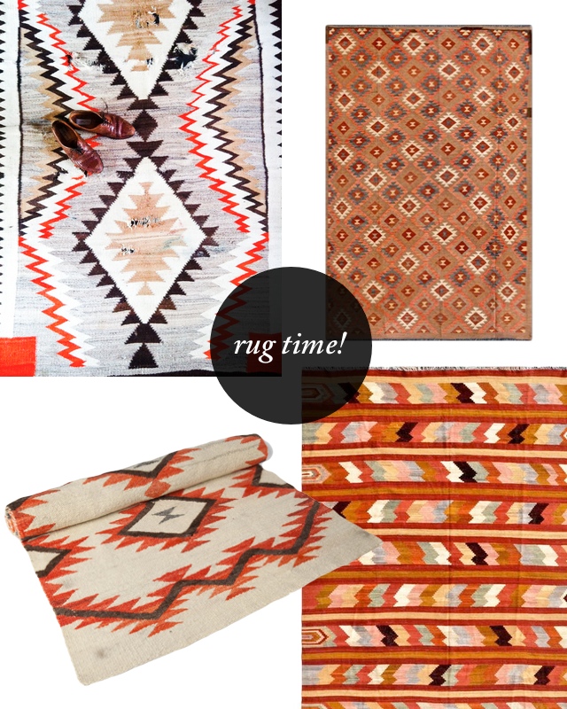
I originally meant for this post to be a set of ‘before’ pictures, but I got a little carried away.  Sorry guys.  Our current living-dining situation has gotten a bit tired to my eyes, even if it makes for some pretty pictures.  It’s the most finished part of the house, however the furniture is mostly an accumulation of stuff from our previous apartments.

It’s fun enough, but not like ‘OMG SOOOO SUPER FUN I CAN’T GET ENOUGH’ fun.  I need more of that in my life.  And I’m hard to please.

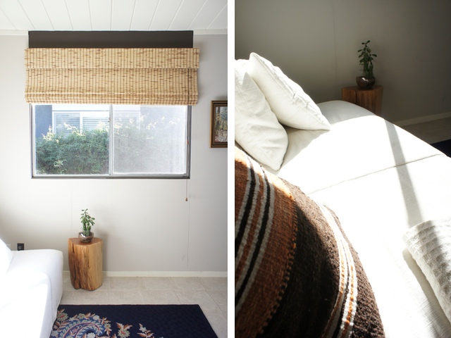
In the process of rearranging things around here, I realized I need to step up my vignetting skills in a big way.  I find it challenging to style such a big open space without any nooks or even window sills to organize around.  I’m trying to decide if it’s that I need more things, or perhaps fewer, bigger things.  I think it’s bigger things, if I recall AB’s advice.

So, please enjoy …

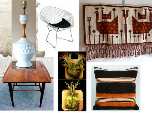
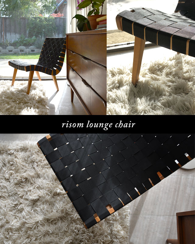
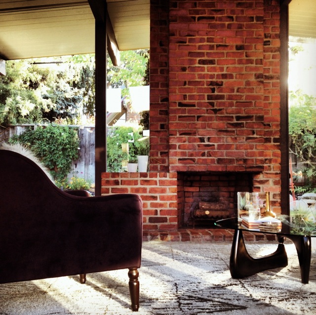
Sources:  Room & Board sofa (a few years ago), rug from West Elm, slat bench from MCMF.  The crazy wood lamp was a basement shopping find and came from Dave’s spinster great-aunt Beezer who got it in Bermuda (doesn’t she sound awesome?)  The Noguchi table is a knock-off and one of the first pieces of non-IKEA furniture that Dave and I purchased together back in Toronto, when we were straight out of school and, admittedly, not very knowledgeable about furniture.  Oh, the memories of getting that thing home on the subway!

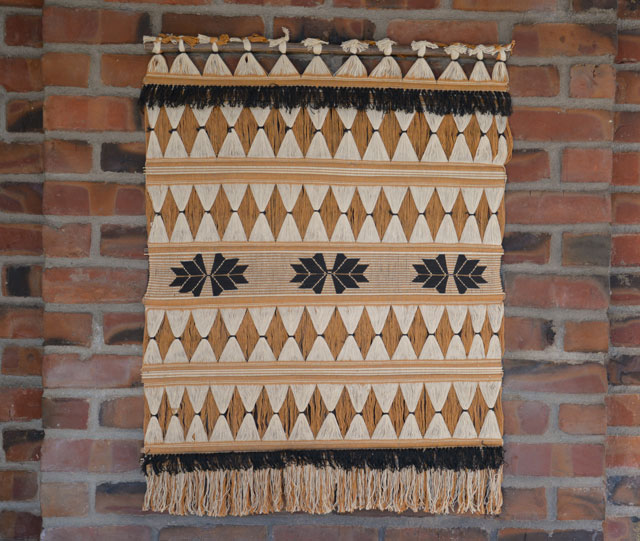
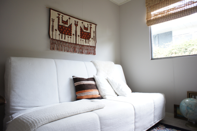
The woven textile hanging is made in Colombia, from Etsy seller syn AND dig, and found its spot above the fireplace somewhat by chance, as I never managed to carry it beyond the living room after unpacking it.

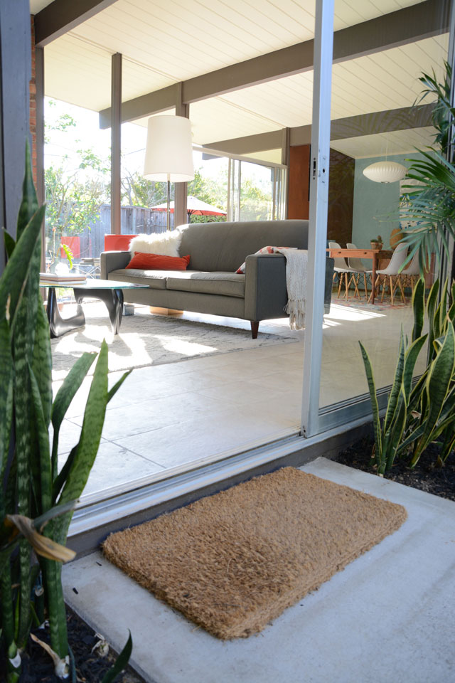
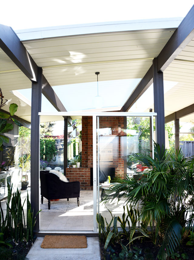
And this is what I get to see when I come home every day.  (Albeit with a large scattering wood chips and dog toys over all over the place.)

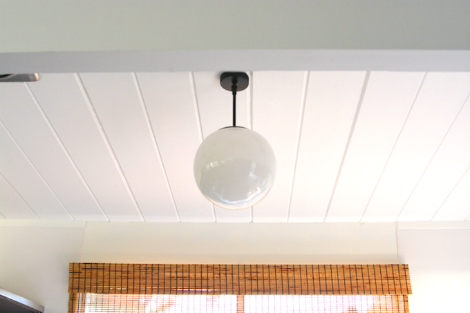
I really love that the reflections make it look like there’s a hole in our living room ceiling.  Optical illusions abound here, friends, especially at night.

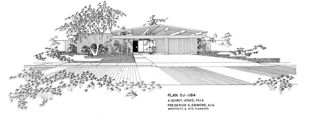
Despite the glorious daylight, having two walls of your living room made of single-pane glass doesn’t exactly make for a cozy room.  It also gets quite dark at night, since we don’t have walls reflecting light as you would normally in your home.

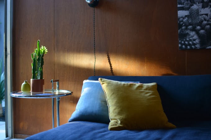
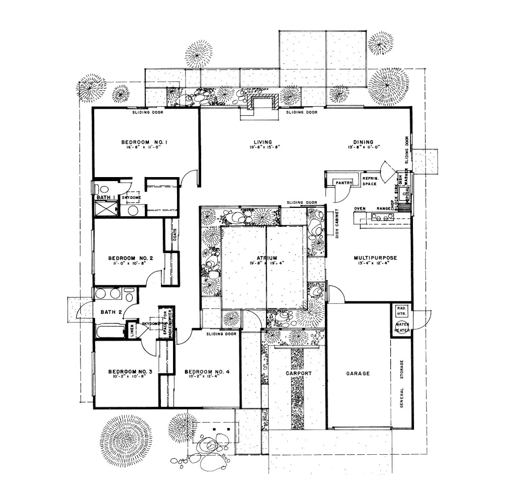
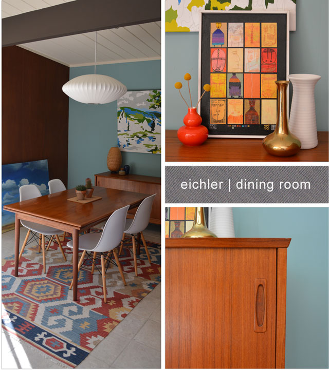
This brings me to the cozier and brighter end of the room:  the dining area.

 
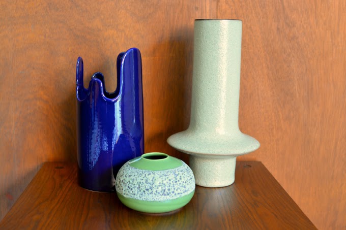
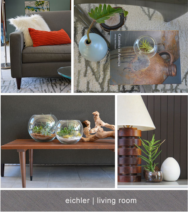
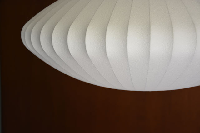
I love our George Nelson Saucer lamp, and glitter-potted cacti.  The cacti are obscuring my attempt at styling the sideboard with larger objects.  I kinda lost my confidence there with the giant ceramic horse head – I promise I’ll do better next time.

That’s how things look now.  And they will be changing.  I find that I’m currently annoyed by the matchiness of the paint colour, the paint-by-numbers art, dining room rug, and various pops of orange.  That, and I need to replace that IKEA rattan lamp with something much more sexy.  It was fun a while ago but is no longer working for me.

What do you think?  If the Palm Springs house was “organic earthy modern”,  I’m thinking the current style of this space is more like “random earthy modern”.

Looks like we have some evolving to do.  I will keep you posted!

photos: Karolina Buchner
layouts: Pugly Pixel

bedroom house tour

chair!

April 18, 2013

Exciting times!  A couple of weekends ago, Dave and I ventured up to the city so that I could at long last get myself this chair for our bedroom.  Oh yes:

curved wood chair with black woven webbing

It’s a lounge chair designed by Jens Risom for Knoll in the 1940s, and was one of the first chairs the company manufactured.  I got it from MCMF – really great people to deal with, by the way, if you’re looking for anything mid-century modern.

The webbing is new, but it turns out the frame carries the original Knoll label (‘Knoll Associates Inc., 601 Madison Avenue, New York 22 N.Y.’ — just like the one on this chair) and it’s likely a first edition, because that’s the address of the first Knoll showroom?  I am going to take extra special care of it.

And that’s the only teaser shot you’ll see of the bedroom, since everything to the left of the chair, dresser, and rug is Sears and tilty grasscloth.  For now.

house tour living room

house tour: living room sneak peek

April 10, 2013

This is one of my favourite shots of the living room.  I love the light we get in here.  I will share more, just as soon as:

  1. I clean all the windows.*
  2. I vacuum and dust ALL THE THINGS!

*Some mud may have been blasted in various directions during last weekend’s power-washing.

Happy Wednesday!  Hope it’s a sunny one!