Browsing Category

love

love

love: woolen blankets

October 11, 2013

After returning from Canada, I am in the mood for some cooler weather.  The Bay Area is not quite obliging however.  What was that last weekend? shorts weather?  Hmph.

On our trip, I got the chance to do a bit of browsing at various shops in the North which are transitioning their goods to decidedly wintery ones.  Wool blankets are everywhere.

And so, here are a couple of quality Canadian blankets which I spotted on my travels.  Their designs are simple and classic.  I find they fit quite nicely in more modern contexts, if you’re not after the woodsy, log cabin vibe (although that can be a lot of fun too!)

For your consideration:

1.  MacAusland’s Woolen Mills tweed blanket — These blankets are soft and lovely.  The pattern makes for a nice, muted Scandinavian look.
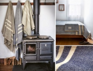
photo sources: 1 | 2 | 3 (mine)

I really like the navy/white and grey/white combinations, and the price point too.  They come from Prince Edward Island, on the Canadian east coast.  I found them at a shop specializing in cottage decor.  David’s mom, Sharon, also pointed out that these are the same blankets used by Suzanne Dimma in her modern cottage which I alerted you to earlier.  If you haven’t seen the pictures yet, go do it

2.  Hudson’s Bay Point Blanket — I love that these iconic blankets have made such a comeback recently.  They are incredibly thick (more so than MacAusland blankets) and very warm.  And they fit right in with modern furniture, as demonstrated by Daniel Kanter’s Manhattan Nest bedroom and by the blanket-upholstered mid-century chair at Sit And Read:
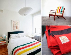
photo sources: 1 | 2 | 3

Made in England, these blankets have been around since the days of fur trading in North America (so, something like 300 years!), with the striped version being in continual production since 1800.  I am now the proud owner of a Bay blanket, thanks to my wonderful parents.  I promise I’ll show it off sometime, but I might try to do something more ambitious with our bedroom before that.

In addition to the traditional multi-stripe pattern, I’m quite partial to the red and black combination.  ‘Fun’ ‘fact’ #1:  Did you know that the ‘points’ (the dark thin lines on the side of the blanket) are there to indicate each blanket’s size?  Sadly, not the number of beaver pelts to trade for it, but perhaps a handy approximation.  That’s always been the Bay blanket lore, as told by certain antique dealers in cottage country.  Fun fact #2:  Did you know Hudson’s Bay Co., the oldest company in North America, recently bought Saks Fifth Avenue?  Oh yeah.  Must suppress overwhelming Canadian pride before it turns into smugness.  Am I succeeding?  No?  Pity.  I tried.

So, California: bring on the blanket weather.  I’m ready.

geeking out love

love: the ikea app

September 4, 2013

In my day job, I tend to keep an eye on certain tech blogs, which recently featured IKEA’s new app.  As is not uncommon, I too have a kind of love-hate relationship with IKEA, but this app really intrigued me.

The best part of of this app:  augmented reality on your mobile device to help you figure out how pieces of furniture will look in your space, BEFORE you go to the store and then spend all evening assembling your new acquisition.  Yes!  BEFORE you’re knee-deep in flat-board packaging, wordless yet cutely illustrated instruction pamphlets, and tiny wood dowels, you can see the furniture in your house!  Like MAGIC.  The promise of this warmed my heart, so I thought I’d take the app for a test drive.

This resulted in the long, geeky post ahead.  Consider yourselves warned.

First, IKEA’s video with a demo of the app:

The idea is quite genius, I have to say:  you place the IKEA [2014] catalog on the ground where you want to visualize a piece of furniture and point your tablet or smartphone at it.  The item is then rendered on your device, with the correct 3D projection and scale.  You can literally walk around the virtual furniture piece of your choosing and check out how it would look in your room. 
How?  Math and computer science, friends.  The realm of my day job.  If you think placing the catalog on the ground is lame, it (plus some object recognition software) is actually the secret sauce here.  Here’s why:
  • It’s a textured object (i.e., it has text and pictures on the cover) and the cover does not change much in appearance, so it’s easy to detect in the image using object recognition techniques.
  • It’s flat and when on the ground, makes it easy to deduce what its orientation in 3D space is relative to the camera on your mobile device.
  • It comes in a standard size, so it’s easy for the software to scale the rendering of the furniture using the size of the catalog as a reference.
So, so smart.  Kudos to IKEA for creating with this.  [Edit:  the developer is actually Metaio, thanks Lin!]

If you’d like to give it a try, you’ll have to have some version of the 2014 IKEA catalog handy.  I tried out the app with the electronic version of the catalog on my laptop and a teeny printout of the catalog front page as my marker, since I don’t have the real thing.

It worked quite nicely, although I was at first annoyed that I couldn’t get to this directly from the app.  But then I wouldn’t be looking through the catalog, which is what IKEA wants me to do.  Sneaky IKEA.  So, for you, my friends, here’s my cheat sheet for getting to the magic bits as quickly as possible.

To get to the 3D product renderings, here’s what I did:

  1. Paged through the electronic catalog on my laptop until I reached the furniture product pages.
  2. Found a page with the red plus symbol used to indicate bonus content is available
  3. I pointed my phone at my laptop screen and waited for the camera to focus and the app to recognize the page

In the app, an image would then pop up indicating that 3D rendering was available.  Here’s a screen shot of what that looks like:

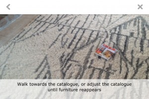
You then tap on the icon and follow the tutorial, which includes a catalog and non-catalog method for rendering furniture in your room.  I opted to use a tiny printout of the IKEA catalog front page with the catalog method:

Once the app detects the catalog, you can select furniture and have it render.  Since my printout was small, so was the furniture (which was kind of adorable).  Winston appears for scale!

And with the classic POÄNG chair, for completeness:

It was a lot of fun visualizing tiny furniture.  I could walk all the way around it and see it from various angles.  My lighting wasn’t the best so at times the app would lose track of where the catalog was, the chair would disappear and have to be rendered again.

I also tried the non-catalog mode and, after some adjusting of the object size and location on the screen, was able to get pretty good results as well.  So, you can play around even if you just have the electronic catalog and a phone, no printout or physical catalog required.

Aside from the 3D rendering, IKEA has packed a tonne of bonus content into their app for the first part of the catalog, which features styled rooms, using the same method (look for the red plus again).  It’s mostly cutesy movies of children and families romping through playful sets, but I found one that blew my mind (a little).  (OK, maybe a lot.)

This one:

Once you click (or tap) through, you find yourself peering through the looking glass at another room:  a kitchen.

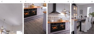
Moving your phone to your left, right, up and down reveals parts of this virtual room you’ve been given a peek into.  Here are a few screen shots I took as I panned my phone around in different directions, looking up at the ceiling, down at the floor, to my right and left:

These screen shots quite don’t do it justice, I realize, but I could look at this room from (almost) every possible angle through my phone.  After a while, I was expecting to see my own feet on that wood plank floor when pointing the phone down.

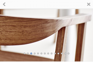
Other bonus features which I appreciated were detail shots of their styling:

I do love the Scandinavian look.  Those chairs, by the way, um… wow.

I think this app may have succeeded in possibly luring me in for a shopping day.  (Or I maybe I’ll just stay home and keep looking at that one kitchen over and over and over?  Possible.)

Back to the 3D rendering, I would love to have an app like this for other furniture.  Which brings me to another app which addresses this exactly:  Furnish.

Furnish provides a similar experience to the IKEA app, but for a variety of retailers.  I tried it out and it’s decent, but without the catalog trick, the rendering is not as accurate as IKEA’s app because it’s up to the user to get things right.  I found that manipulating the 3D rendering was pretty finicky (just like IKEA’s non-catalog mode).

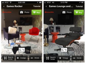
You can check out Furnish in your app store for more details.  I tried it with a few modern pieces, and thought I’d share the results:

Not bad.  The app was pretty good at detecting the orientation it should render the chair in (better than the IKEA app in my opinion), but the scaling was off and required that I do my best to guess what the size should be.  That would be my biggest complaint.  When trying out new furniture, I really want to see how much space it takes up in my room.

Overall I really enjoyed playing with both of these apps, though we still have a long way to go.  I would love to have things render in the correct scale without the catalog trick and to be able to render multiple pieces in one view.  A mashup with Google Glass would be amazing.  And I would be delighted if my other favourite retailers (DWR, West Elm, CB2, Serena & Lily) offered similar apps.

What do you think?  Have you given either of these a go?

(Nope.  Not a sponsored post.  Just some fun geeky times.)

furniture love

love: telephone chairs

August 30, 2013

Hi there, friends.  I realize it’s been a bit quiet around here since my living wall update and there’s a good reason for that, trust me.  I can’t really disclose too much except to say this side-project has me doing a LOT of research.  The best kind:  furniture research.  Squeee!

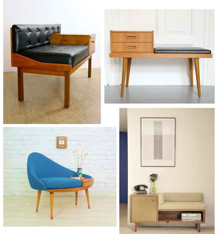
And it has somehow lead me to a piece that I bet a few of you know well and which I recall from my great-aunt’s house:  the telephone chair.

Edit:  For those of you who are much too young to remember (you know who you are), a telephone chair is a little bench/chair with an elevated part upon which you set your rotary dial phone and in which you probably kept your address book.

In particular, I’m looking at telephone chairs with some midcentury sass and finding some amazingness:

 Photo sources (clockwise from top left):  pinterest | precious.no | ARC | pinterest

Ugh.  Crazy, right?  Right.

I know what I’m going to keep my eyes peeled for at the next antiques mall or flea.  Thrifting this weekend, anyone?

furniture love

love: miyazaki chair factory

July 10, 2013
Aloha, friends!  As you might tell from my posts on Instagram, I’m on a vacation tag-along trip in Maui right now, and so thought it might be fitting to share this as we’re half-way to Japan, right?  I’ll be back next week, in the meantime – hope you’re having a great one!

A few months back, I posted about a certain settee and how it looked like an anime monster.  I only recently noticed that I was getting hits to my blog from searches for terms like “miyazaki furniture” and was a bit puzzled as to why.

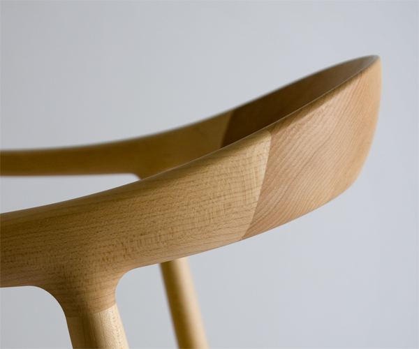
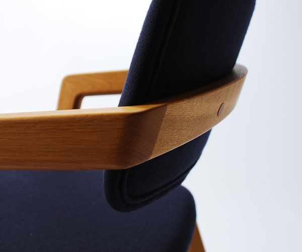
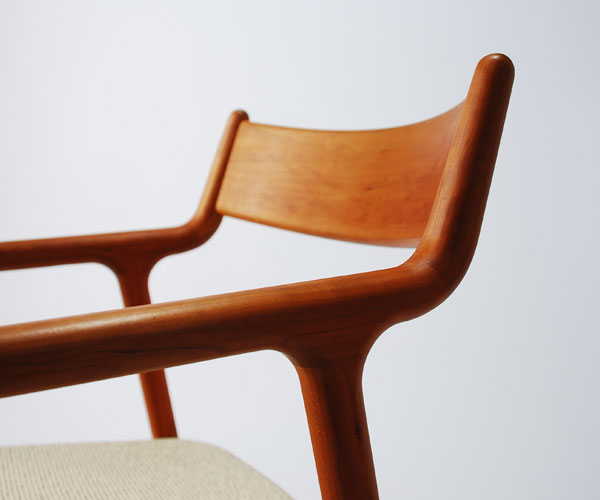
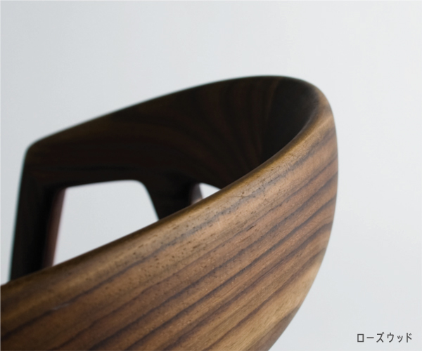
After digging around, I was pleased to discover that Miyazaki Chair Factory is a furniture maker in Japan.  And even more pleased to discover that their stuff is A-MAZING.  For the chair-obsessed, like me, these images may be a little too exciting.  Miyazaki’s chairs look handmade and gorgeous and I want to touch ALL of them.

From top:  Hata, Kuku / Kuku Muku, and Pepe

I am in awe of the craftsmanship that goes into these.  You’ve got to love a company that talks about its team of craftsworkers, who use machines as their “extended hands” and are continually honing their skills.  It’s definitely reflected in a product that shows how carefully and beautifully it was made.

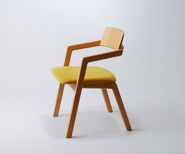
While the adorable cantilevered Kuku (in the second and third pictures above) comes in at a close second, the DC09 might be my favourite of all:

A number of the recent chairs at Miyazaki, like the DC09, are by design firm Inoda+Sveje, a Japanese and Danish design duo.  I love this blend of design sensibilities which seems to be best embodied by the DC09.  It’s so reminiscent of Danish v-leg chairs but with a more refined, sculptural quality.  Denmark meets Japan.

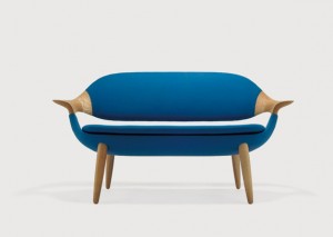
Inoda+Sveje’s work also includes the IS sofa.  I am trying to imagine it in person, and it’s making my brain tingle.

 
Yes.  This thing exists and is a real sofa.  For real.

I think of all of these pieces as works of art.  Indeed they are quite pricey.  But then, maybe you’re in the market for an investment chair or two?  If so, let’s get together and discuss over lunch, please!

Regardless, if you’d like to see more of these beauties, check out Miyazaki Chair Factory, whose site includes a very charming description of each chair and the story behind it plus a peek into their manufacturing process.

(Not a sponsored post.)

All photos via Miyazaki Chair Factory and Inoda+Sveje

art love

love: ashleyg for urban outfitters

April 30, 2013

(Hello from Paris, to all of those who follow me on Instagram.  I’m taking time at the end of my work trip for some shopping among other cultural things and I’ll be sure to report back soon!)

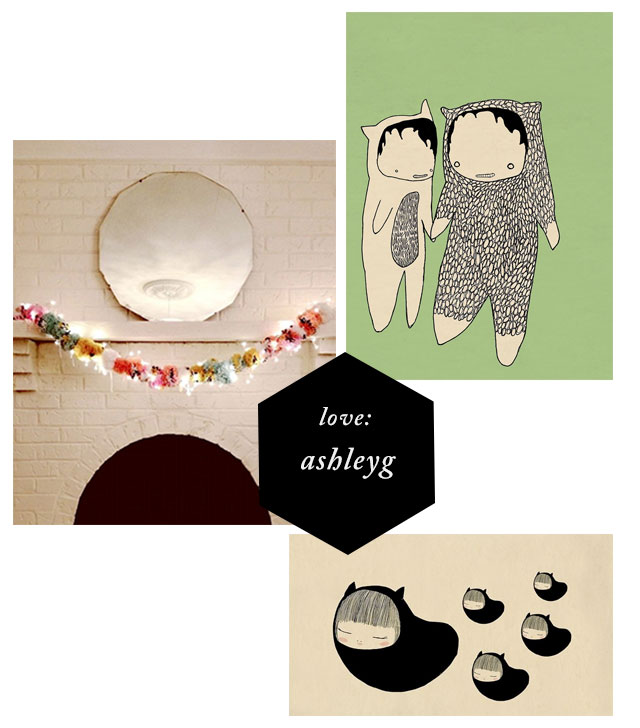
I’m interrupting the house-related talk here because I wanted to make sure you know about Ashley Goldberg.  She’s an artist based in Portland, she is Etsy-famous, and I love her work!

The subjects of Ashley’s paintings and drawings include little girls, monsters, and superheroes.  They are thoughtful and serene creatures, cute without being too saccharine, and I would like them to be my friends.  I bought her ‘You Make Me Happy’ print as one of my very first Etsy purchases years ago (hanging over the desk I write this from), and have been fascinated by what she’s up to ever since.

In addition to her Etsy shop, Ashley chronicles her vintage shopping and new-house-furnishing projects on tumblr.  Her home in Portland is simple and airy with both modern and vintage design elements living happily together.   Her pom-pom garland featured by Design*Sponge has lead me to possess more yarn than I know what to do with.  On flickr, you can get a very cool inside look at her works in progress, lately including a lot of neon brights and patterns, which I am very excited about!

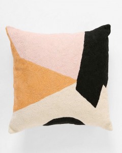
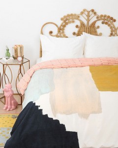
Her most recent collaboration with Urban Outfitters, Char-Bea, consists of bedding and soft goods to throw around the house (pillows and rugs).  The patterns and colours are very playful and free, with lots of painterly textures and nice pops of black which lend some gravity to them.

I am particularly smitten with the soft palette and texture of this pillow and bed linens:

You can find the rest of Ashley’s collection at UO.

(And no, this is not in any way a sponsored post.  I’m just a huge fan of Ashley!)