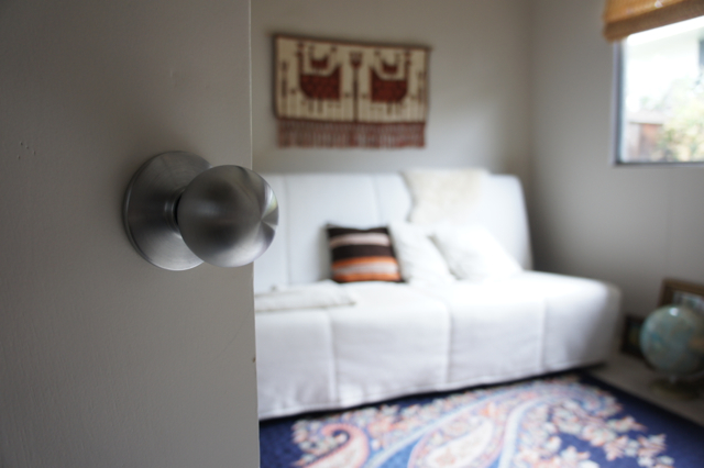
As a respite from that ugly beam (sorry guys), I thought I’d continue with our house tour and share my favourite room with you: our guest room. I love that it’s cozy and kind of its own little world. It’s on the small side, just about 10′ square.
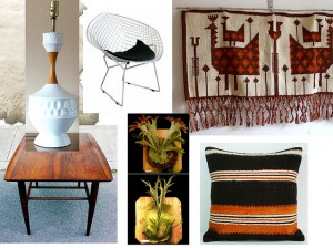
Here’s what the my rough plan for the room looked like, back in the day:
The Danish wall hanging was the jumping-off point for the neutral and warm palette and accessories. It was featured on the Etsy blog as a pick by Morgan Satterfield of The Brick House, and given how much I love Morgan’s style I probably deliberated for about thirty seconds before buying it.
When we don’t have overnight guests, which is most of the time, this room is my little hide-out.
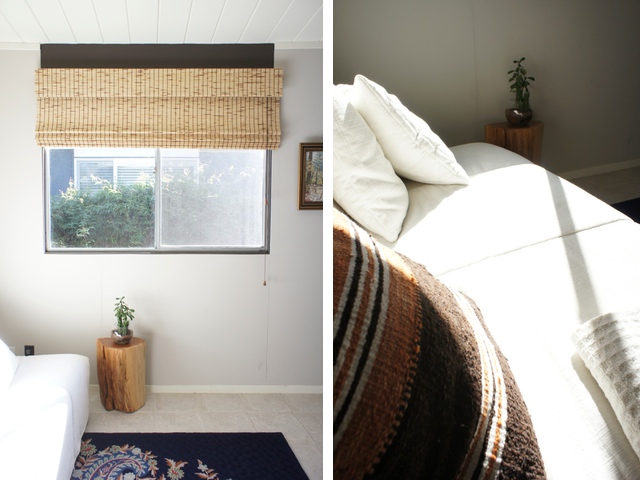
I really love the light that comes in here, even if it’s only a few short hours a day, especially when it’s all dappled through the matchstick shade. It’s very satisfying to sit in on a sunny weekend morning with a cup of tea and my magazines (ok, they are mostly catalogs). I get to take in the light without feeling too guilty about not being outside bright and early.
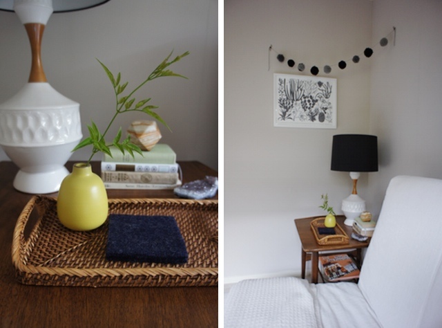
While the basics of the room came together pretty early on, I’ve been tweaking it here and there. The above sunny shots were taken early on in the process, and I couldn’t help but to include them. They’re so bright and happy! Having recently added my staghorn fern mount and a few accessories, there’s more dimension to the room now and I’m liking the feel of it.
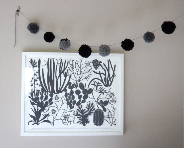
Resources: Bassett side table from Midcentury Mobler; stump side table from West Elm; rattan tray from Crate & Barrel; sheepskins from IKEA; Danish wall hanging from Project Sarafan; midcentury ceramic lamp from Loverly Vintage; kilim pillow cover from Sukan; onyx-marble polyhedron from Sky Parlor; cacti screenprint from Banquet Atelier; bud vase from Heath Ceramics
I realize there is some inconsistency across these shots but I keep messing with things and then re-shooting. And it’s a teeny room to try to shoot! I basically have to smoosh myself in any void possible to get head-on shots of furniture. Anyway, enough sobbing. I love my teeny room nonetheless.
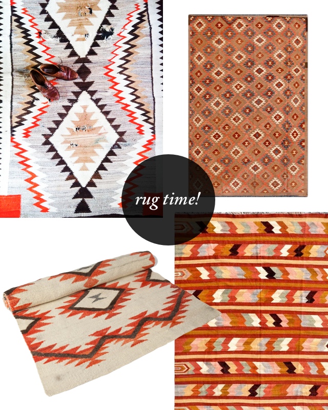
Of the things I’m not quite satisfied with, one is the rug. The IKEA Beddinge sofa I guess I’ll live with (it is comfy for sleeping), but the rug I can change. I enjoy that crewel-work rug tremendously and got a super deal on it at Anthro a few years ago, but it doesn’t really fit with its gigantic paisley pattern. And, after seeing some great patterns around, notably on Design*Sponge, I am considering some options.
You know what that means . . .
The Navajo patterns are so good. All those triangles and great colour combinations. I will let you in on a secret though: the kilim rugs on Overstock are surprisingly great. The one in our dining room previously came from there, so I’m quite tempted to take another gamble and try. Vintage rugs are so lovely, and definitely have a different feel to them, like the beat-up one captured by Dabito above. Still, the third rug in that set looks pretty fantastic.
Perhaps I could achieve the worn-in look by letting Winston spend some time with my new rug? Sounds like a plan to me.
Photos (except rugs) by Karolina Buchner





3 Comments
It’s always rug time. 😉
Definitely love this bright and clean guest room! May I ask where did you get this perfect futon? 😃
Hi Lisa! Thanks! That’s the IKEA Beddinge, back when they made white covers for it.