As I alluded to in an earlier post, I’m planning to change up our living + dining space. I’d like to go in a more mid-century Scandinavian direction, but not with the entirely black and white colour palette typical of Nordic styles, because, hey, we’re in California! And California knows how to party, I’m told. Let’s get started.
In the “woe is me, I own an Eichler” department, I will say that having a huge open space makes it challenging to design the dining room. Because it’s not just one room. It’s all of the rooms! Our living room, dining room, kitchen, and breakfast nook are quite continuous, with one wall connecting the spaces. Currently that wall is a teal-ish blue chosen, I’m sure, by the staging company which prepped the house for sale, for maximum universal appeal to buyers. I really want to put my stamp on the house, so even though it’s not at all offensive, the blue is definitely going.
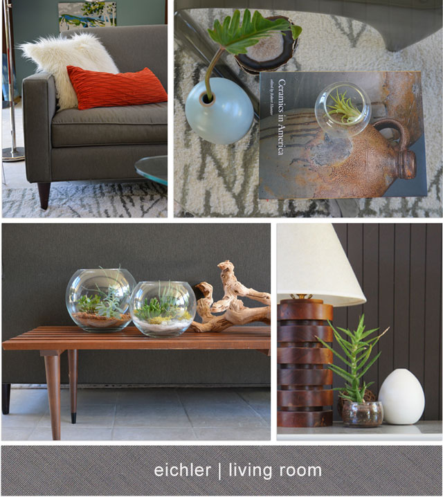
As I look around the space now, I find my eye rests on the white elements (Eames chairs, white ceramic pots, fluffy sheepskin pillows) and I enjoy that. I’m hoping to add more white and pare things down a bit by restricting the number of colours. Sorry, multi-coloured kilim rug and orange pops of colour, you will have to go along with the teal.
I also want to add more drama. Somehow. Perhaps, a big swatch of colour with an animal staring you down while you eat dinner?
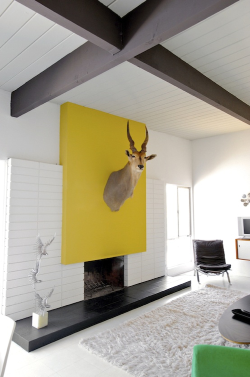 |
| Source: Dwell via Design Milk |
Yeah, just like that. A touch of insanity whimsy!
I think my vegetarian husband would find this deeply disturbing (and heck, me too — doesn’t that creature look kind of angry?) so I’m keeping this concept in mind but will probably skip the actual taxidermy.
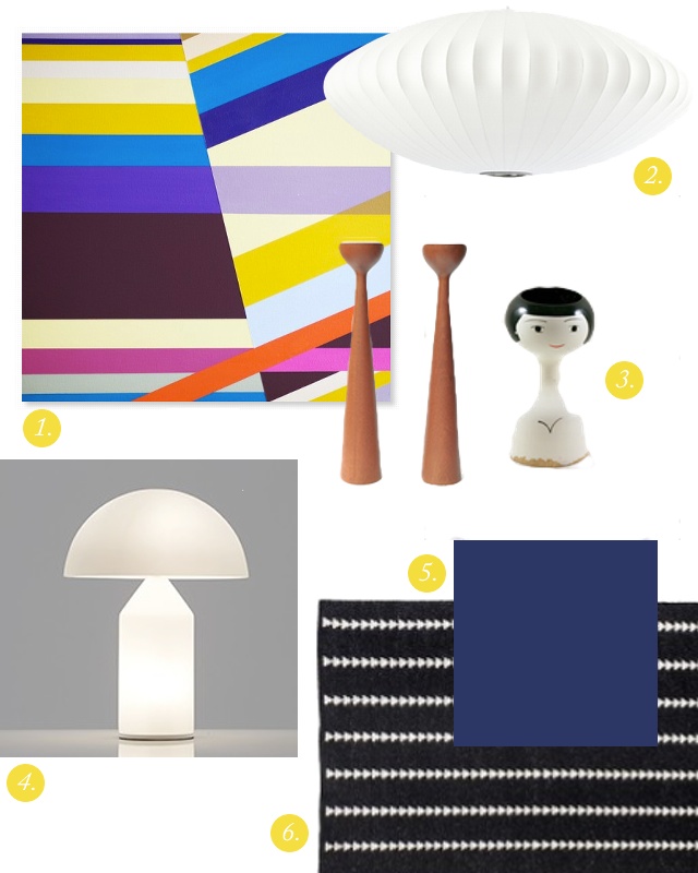
Here’s a possible direction in terms of colours and textures:
And the run-down:
1. Untitled 12.1.12 by Richard Blanco
I found out about Cureeo from Emily Henderson’s blog (this lady is so talented and I really appreciate seeing how she does things). It’s a site where you can buy reasonably-priced, original art work that is nicely curated for you, so it’s very easy to shop and pick out something cool and one-of-a-kind. This piece is bright and fresh and just serious enough, but I’m not 100% sold on it yet. Deciding on the art is a challenge. Do I go bold and colourful or maybe neutral and texture-y? I may wait and play the ‘Art Goes Here’ game after painting the blue wall. In fact, I’m pretty darn sure of it. Stay tuned.
2. George Nelson Saucer Lamp
The mid-century geek favourite. This is already in the room and it has a great sculptural quality which I want to repeat…
3. Assorted Danish candleholders via Etsy
Yes! The cute lady is a candleholder. I’m going to need some tall pieces to sit on top of our teak credenza, as I currently have mostly short things that are too small.
4. Atollo Table Lamp
This is my dream lamp. I think it would do splendidly in helping to continue the sculptural theme here. The Atollo is an iconic lamp designed by Vico Magistretti for Oluce, a long-standing Italian lighting company. It’s a piece of art in itself, as you can gather by reading the product description on the Oluce website. I challenge you to read that description and not be moved!
5. Benjamin Moore’s Admiral Blue
This would be the new colour for the wall that connects our living, dining, and kitchen areas. I think this should pair well with the mahogany paneled walls which account for two of the dining room’s three walls. It’s dramatic but cozy.
6. Nate Berkus Arrowhead Rug
A nice black and white foundation to keep things sane while adding some Scandinavian-ness and woven wooly texture. It seems this rug is everywhere these days, but I really like the pattern and the very reasonable price point offsets the potential dream lamp purchase. It’s perfect!
What do you think? Any art suggestions out there?

3 Comments
LOVE the direction you’re going in!
Can’t wait to see this all come together! And love that bold blue!
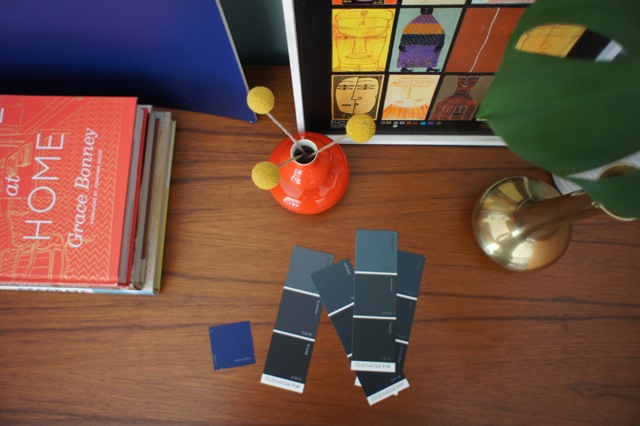
Thanks guys! It’s going to be a process. I’m currently testing out that blue on a large posterboard and it’s pretty intense. I’ll keep you posted!