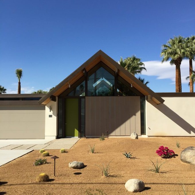
On our recent spring trip to Palm Springs, we decided to visit Kud Properties‘ Desert Eichlers. In case you hadn’t heard of them, these are entirely new homes based on Eichler floor plans, not exact replicas, but Eichlers re-imagined for today in the context of the California desert. We toured the two newest models: a flat-roof, atrium model, and this spectacular double A-frame. There are plenty of images of these homes, so I’ll share just a few highlights here… highlights that I might, you know, borrow for a future project.
We’re looking at a possible floor and bath remodel in our own home, so I snapped pictures as we toured each of the houses and took note of the finishes. I’m all about the finishes these days. Especially flooring. Currently on the fence about which direction to go: tile (very practical, given our in-floor radiant heating), cork (one of the traditional finishes, nice on the feet, cozy), or VCT (the most ‘Eichler’ option, and least expensive). But more about that later. This visit was very much about seeing some options, so let’s go!
First up: Desert Eichler #3
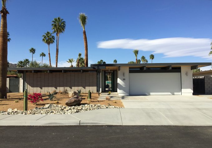
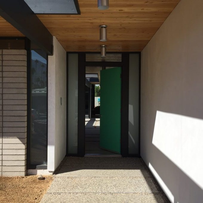
I love that the front facade includes a cinder block wall and aggregate pavers, a nice nod to the more traditional mid-century finishes. The colour palette is unlike what I’ve seen in the Northern California, or many Eichlers period– but this is the desert, and the white looks perfect here.
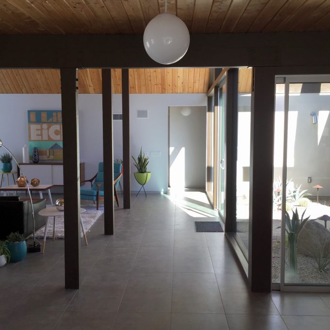
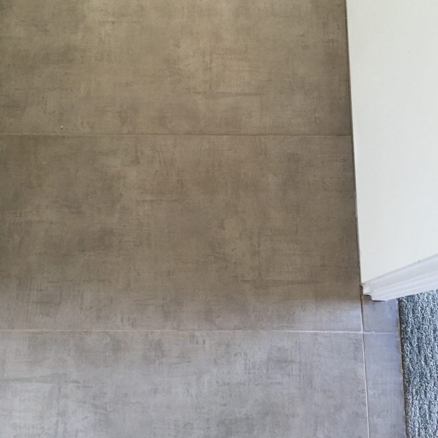
Inside, the entire house is finished in a large gray ceramic tile, 12×24″ in size.
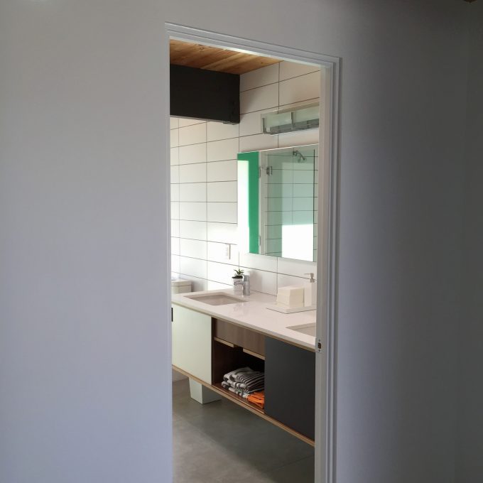
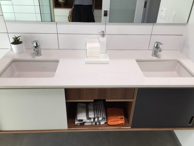
The colour scheme in the second bathroom in the house was the one I liked best. The walnut ply Kerf cabinets, large rectangular tiles, gray tile floor, gray grout– perfect. And that green. It’s not quite emerald, not quite teal… just right in my opinion.
A brief detour to the backyard: lots of very nice cement paving, and a gorgeous pool. Very Palm Springs.
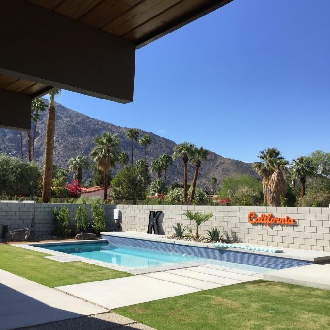
Though I’m not sure how I feel about that cinder block wall, I could live with this backyard. The K made me feel quite welcome.
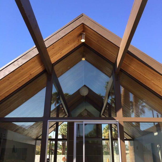
Next: Desert Eichler #2 is a slightly scaled-up version of a original model in our tract, and quite dramatic. And this is the view that greets you after walking through the front door. Major wow factor here.
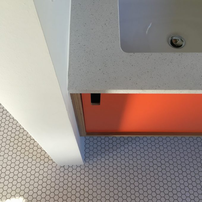
In the bathroom, the builder used the same quartz counter tops and cabinetry, but with this great little hex tile with gray grout. Love the pop of orange in this otherwise neutral bath.
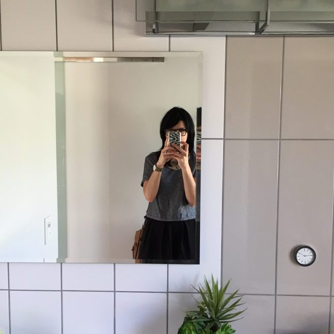
Oh, hi there.
More gorgeous subway tile, this time laid vertically with two different tones next to each other. I’ve tracked down that white hex tile you see on the floor, for the curious, right here. I’m still wondering about those big subway tiles. (Also, please excuse my clawfingers in the shot.)
Here’s my preferred floor tile, of the two houses– a neat cross-hatch:
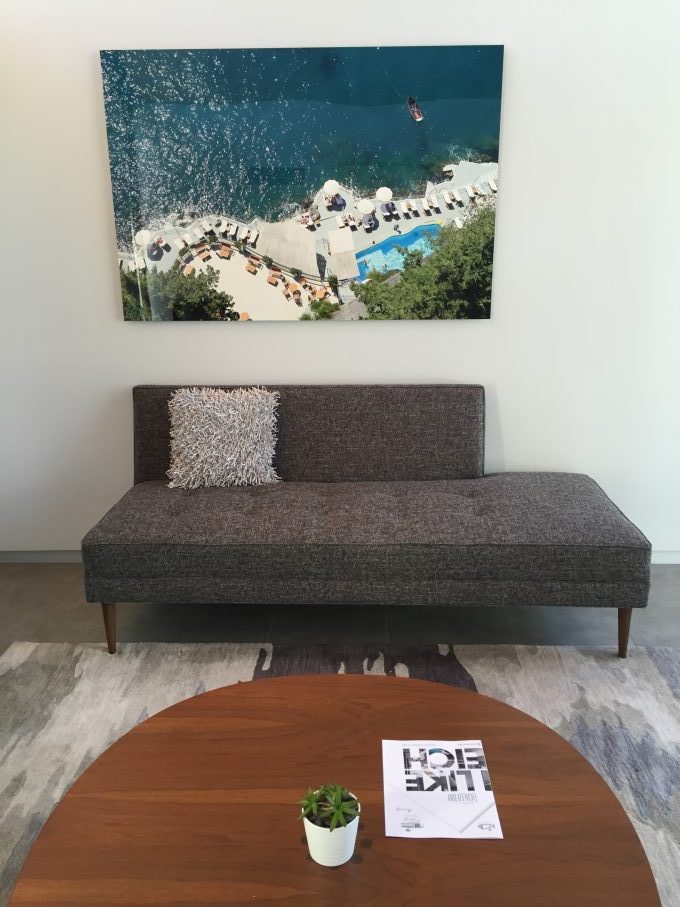
The front guest-room-slash-office-lounge was my favourite room. I loved the warm gray of that rug and settee plus wood grain of the table. (I believe the settee is from The Hunt Vintage.)
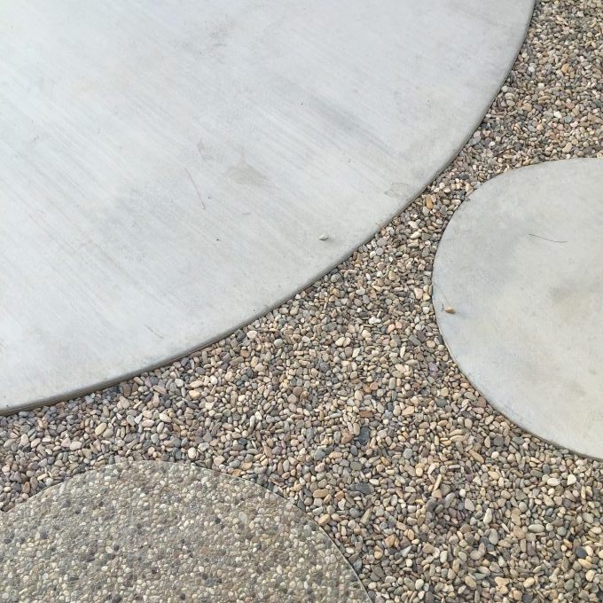
Some nice details from the atrium: a mix of aggregate, broom-swept, and smooth concrete pads.
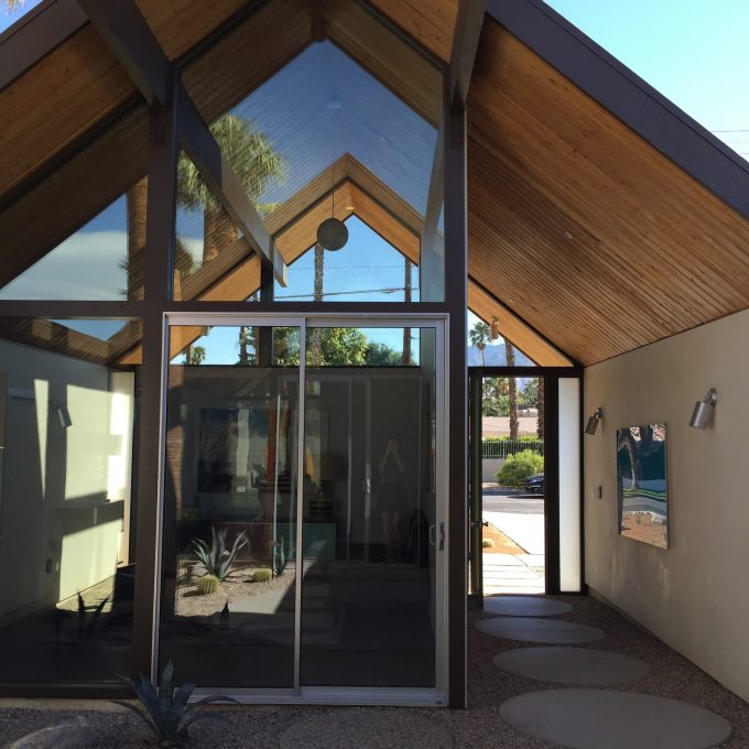
And that view.
There’s a lot to love about these houses. If you’re in Palm Springs, be sure to catch an open house.

No Comments