(Hello again from Paris! So sad that our trip is nearly at an end, but I have many things to share with you as soon as I get back home. Until then, I have to share this post, out of a need to inform you all about geeky things that are imporant to me.)
After we moved in to this house, I became a bit obsessed with tracking down its original floor plan.
What I really, really wanted to find was the original builder’s certificate, which I’d seen in another Eichler garage while we were house-hunting. I remember it well: it was a heavier card-stock paper, yellowed with age, with all the details like the parcel number, the builder, the year, the model, and so on filled out in pencil, in a heavy but lovely hand which reminds me of the way our school teachers would write on the chalkboard. Proper writing.
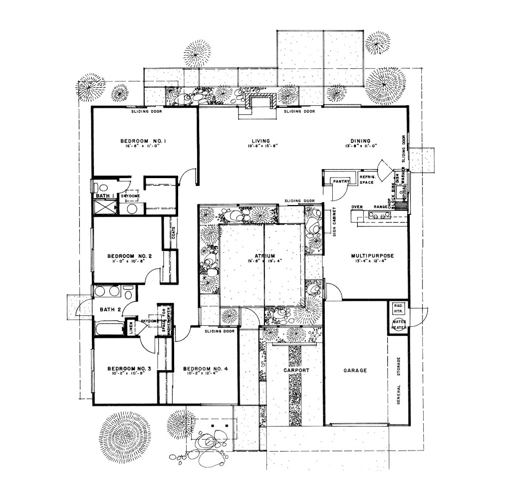
After an overly thorough search of our own garage which involved getting some gigantic cobwebs in my hair, I passed on finding the builder’s certificate. I did find a few home inspection certificates of an appropriate vintage stapled to one of its walls, and instead started searching online for the next best thing: the original design and floor plan. There are a number of Eichler communities with various floorplans archived, notably on the Eichler flickr group. My searching did not turn up the exact plan, but I found the closest I am likely to get:
 |
| Source: Eicher SoCal |
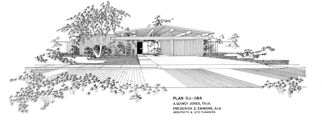
Isn’t it gorgeous? In a super-nerdy way? I love the rendering of the front.
The floor plan comes from a subdivision of Eichlers in Southern California, and is just about dead-on. We have the same carport + garage configuration, four bedrooms, and two baths, situated almost the same way. The only differences in our house are:
- Kitchen: There is no pass-through from the kitchen directly to the dining room. The range is on the wall opposite the oven. And we don’t have the big pantry, but we do have the dish cabinet — in the same spot!
- The entrance to bedroom 4 is not at the end of the main hall. Instead that space for the washer and dryer is rotated 90 degrees to the right, so it ends the hallway, and you have to go around it to get to the third and fourth bedrooms.
- We don’t have a sliding door from the dining room to the side of the house.
… and a few other small details, like the way the atrium and back patios are laid out, and the hole in the roof overhang at the front of the house (pictured in the top rendering) — ours is solid.
In case it’s not clear from the plan, the atrium area is open to the sky. This is probably one of the best features of this house, and makes for some memorable times. Like when one of our friends’ kids got pretty confused about being inside the house but also seeing the moon straight overhead. Or when we watched a certain little boy running laps with much glee through the living room, down the hall, out into the atrium and back again through the living room soon after we moved in. Or how my mom would never know which shortcut to take to get to the kitchen when visiting. She may have gotten lost once or twice.
I hope this helps sort out how things are laid out, as I take you all through the house.
Did you notice the door from the second bathroom opens to the outside? We’re still wondering why this was done. Does your home have any surprising features that you discovered after moving in?

3 Comments
this is so cool!
Awesome! I think this is the same floor plan as ours except flipped!
Hi Kelley! I have since seen that idea in a few of the old marketing images Eichler used. Very cute. 🙂 Thanks for stopping by!